
The Creative Director of Little, Brown and Company, Mario Pulice, discusses trends in book-cover design, and the intricacies of visually capturing the essence of a book.
Perhaps no year has been better for taking account of what we actually live with and like than 2020. For many of us, that has been taking stock of our personal libraries, purging and curating and displaying our prizes, tucking away our guilty pleasures, and donating our outgrown interests.
2020 was a hard year for physically browsing bookstores. However, book sales continued to rise for those quarantined at home who wanted to finally take a crack at The Power Broker by Robert Caro, learn a new skill or way to cope with lockdown (Get Out of Your Head by Jennie Allen), or find escape through the written word. Organizations like Bookshop.org, a site supporting independent bookstores (currently about a fifth of the country’s 2,500 independent bookstores sell through them), launched in January of 2020 and took a bite out of Amazon’s books sales (which continued to soar themselves), with daily revenue highs reaching $150,000. And, we started really looking at our collections.
Our Personal Relationship with Books
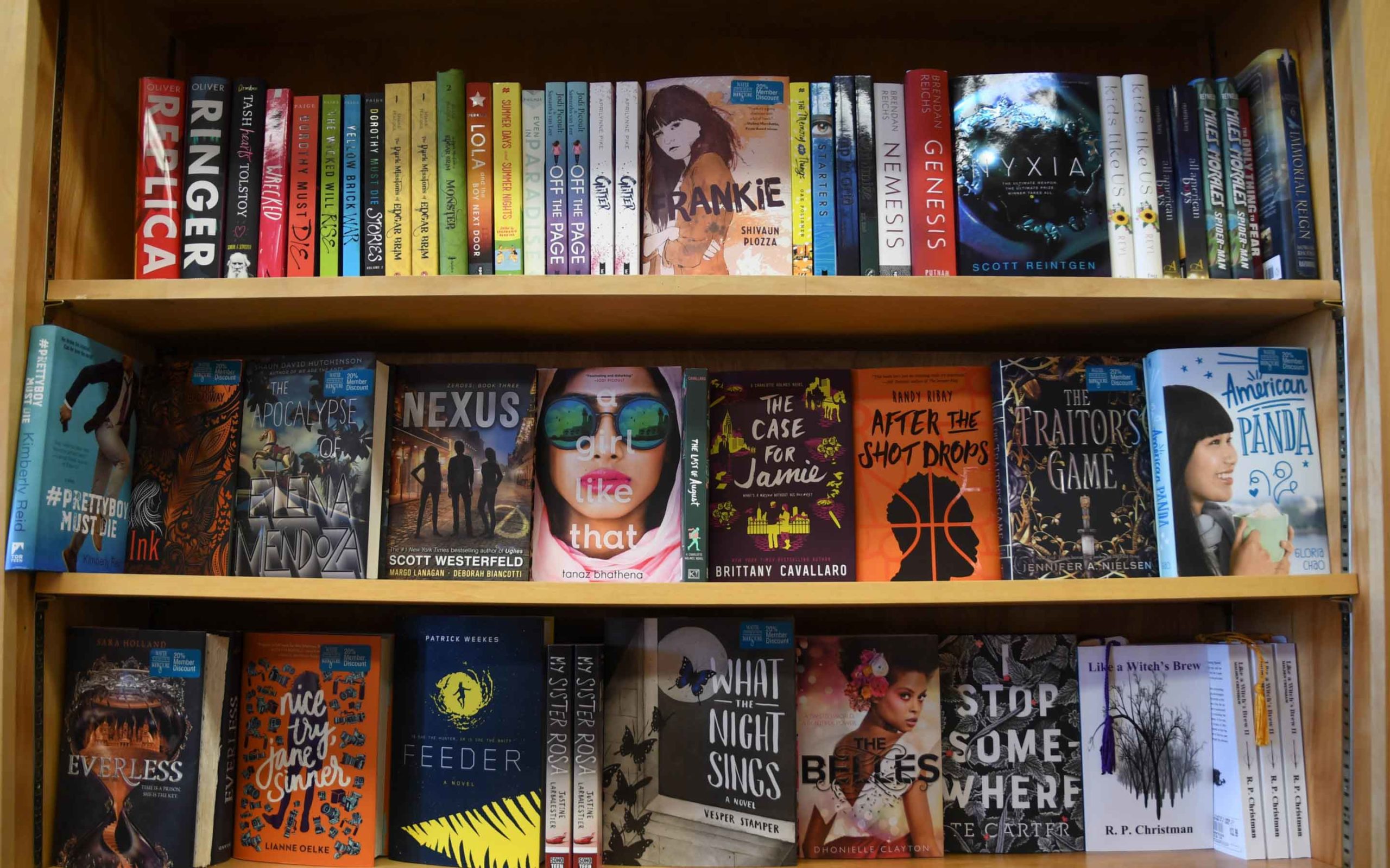
Whether you organize your bookshelf by color (controversial!), genre, chronology, alphabet, or size, suddenly there was a lot of time to inspect exactly what you’d collected and why. Hardcover books made makeshift standing desks, and favorites reorganized to be visible in the corner of the Zoom window screens indicate to colleagues or facetime dates hints of an interior life, interests beyond the four walls of your home, and a personality behind the screen.
 Sometimes you just want to impress a colleague. Image via insta_photos.
And, as we peered into each other’s homes through those same screens, whether curated Instagram shots or more frantic teleconference peeks, the uncanny valley of sameness started to unveil itself. Is it possible that we all really bought the same couch wildly advertised to us on Instagram? Is everyone eating the same feta pasta TikTok recipe for dinner, and watering the same plants? And could it be that we’re all recommending the same books, posed just so next to our matchas? If a general sense of haunting similarity washing the bestseller list in terms of aesthetics has struck you, you wouldn’t be alone.
Creating the Perfect Book Cover
Book jackets, like coffee orders and jean cuts, are just as conscious of and subject to trends as anything else. But, for objects that we hopefully live with for a long time to revisit again and again, or, in best cases cherish, pass on to a friend, or proudly display, a whole lot of thoughtfulness goes into their presentation. Mario Pulice, a veteran of the book publishing design industry who, after thirty years at the country’s top publishers is now creative director of publisher Little, Brown and Company, leads a team of design masterminds to create and conceive of many of the covers that we come to live with, trade between each other, and use as the architecture of our days (sometimes even literally holding up our screens).
Pulice tells us a little about how a cover comes to life, what rules (if any) you need to follow when designing your own, why things can start to look a little similar across book jackets, and the importance of making sure a book looks great both on your nightstand and in your friend’s BookTok. “I’ll never forget my very first boss at Macmillan’s, first day I was on the job,” says Pulice. “She sat me down, and she said, ‘I’m going to tell you something and don’t ever forget it. If a book fails, it has a bad cover. If a book succeeds, it was a great book.’ Of course, I know very rarely is it the case that a book cover will destroy a book, but it can certainly add to sales.”
Whether you want to know how to position your own book for its best chance in the world or just understand why things might start to look like they’re blending together, Pulice pulls back the curtain.
An Interview with Mario Pulice
Shutterstock: It seems like there are pretty clear trends that go into book-jacket design. Are similarities across covers, like color schemes or style, based on successful book sales? Or is there one designer whose aesthetic is really popular, and who’s getting hired again and again?
Mario Pulice: It’s a little bit of all of that. It would be foolish for my art department not to be aware of what’s selling out there—how it looks, trends. But, I don’t want to be completely guided by that because I feel like we do a disservice to the book. I’d rather approach the book as its own entity, giving it its own style and personality. We want to make each book unique, and I feel like it’s a detriment to just put it into a genre and give it a look before we’ve read it, before we discuss the marketing of it.
That said, Sales is a very powerful force in our industry. And often, they will come to us and say, “Listen, we really need it to look like X. That’s what’s selling right now. This is the look people are responding to.” That can be a challenge because sometimes they like something that is so distinct and I have to argue the market is inundated with this look. We’re going to get lost on the bookshelf. Especially with a first-time author, you want them to stand out. You want the consumer to walk into a bookstore, go on Amazon, see something that might ring a bell, but is fresh and intrigues them. Because I’m repulsed by the copying idea.
 People are often drawn to a book simply because of its cover. Image via LStockStudio.
SSTK: How much do you consider the narrative of the book when you’re designing the cover? Or is it more tone and genre-based? I’d imagine covers are symbiotic to the book, but it’s ultimately a tool to sell, so you want to be a little muted, to not overpower or give away anything too important.
MP: I will only read the book to the point where I have ideas, and then I’ll stop reading it because if we read the whole thing and start analyzing it, we might give too much away. Personally, if it’s a novel, I just want to get a feel for the protagonist. What do they look like? If I am going to portray them on the cover, are they tall, short? I’d rather be more evocative of the book than give it all away on the front cover.
The hardest thing, as a designer, is that you want to have a concept. You want to show that you thought about this and that you’re engaging the reader and giving them something to think about on the cover. And, that is a hard struggle because sometimes we’ll present something that’s a little high concept, and Sales are like, “No one’s going to get it. We can’t do that.” I feel like they underestimate the readers, but you can’t swing too niche either.
David Sedaris, for instance, really knows what he wants going into the process, and at the end of the day, his covers are always amazing. Because he is very smart, and he’s funny as all hell, and he wants us to put something on his cover that’s going to make his readers laugh or smile or just nod their head like, “Oh God, here we go.”
He wants to be provocative because his writing is provocative. We’re not going to give him a cookie-cutter. He’s never going to accept it. I’ll never forget from one of his books—When You Are Engulfed In Flames—he wanted a Van Gogh of a skeleton smoking a cigarette, and Sales were going berserk. We can’t have a skeleton smoking a cigarette! It’s off-putting! It’s really creepy! No, no, no. Convince him that this is all wrong. The publisher went to him, and David was like, “Hmm, I hear you. No, we’re staying with it.” And he sold a zillion copies. The cover was commented on over and over about how genius it was.
I’ve had very clear examples in my career where a cover has really helped the sales. Pulitzer Prize-winning author, Stacy Schiff, wrote a biography of Cleopatra (Cleopatra, A Life). The whole premise of her book was how Cleopatra has been completely misrepresented and that people see her as Elizabeth Taylor with the asp. And, that is completely wrong. There are no real paintings of her that are accurate. [There are coins on which she’s depicted, but] I didn’t want to show a coin on the cover. So, I hired a fashion photographer. I hired the model. I had her dress made. It was probably one of the most elaborate photo shoots I’ve ever done. We did a three quarter portrait and didn’t show her face, just her hair with pearls, the most expensive jewel in Cleopatra’s day, woven through it, and her dress.
Stacy was thrilled. Sales was incredibly nervous. And, the book became a number one bestseller. I’m not saying it was because of the cover, but I know that the cover was pretty shocking to people. Stacy Schiff went on The Daily Show with Jon Stewart, and the first thing he commented on was the cover.
 Sometimes you must get creative when emulating a time period. Image via Everett Collection.
For her book on the Salem Witch Trials (The Witches: Salem, 1692), we did the same thing. Photography wasn’t invented at the time of the trials, there were only these kinds of craggy etchings, and they were inaccurate. And, I convinced Stacy again. I said, “Hey, we had a hit with Cleopatra. How about trusting me to do it again with The Witches?” I altered the photograph in Photoshop and Illustrator and blurred the line between photograph and painting, to make it look like a painting.
SSTK: Speaking of photography, are there guidelines around how photography is used on covers?
MP: I love using photography because I’m a little bit of a control freak. I can put together several images into one image and make it look like an illustration, but the heart of it is photography. I would say 75-80% of the covers we do are based on photography at Little, Brown. That’s not a ratio that is far off in the entire industry. To commission an illustration is often very expensive, and if we can use stock photography and create our own illustration, it saves a lot of money. And often, these books don’t have a big budget.
SSTK: When you’re looking for stock photography, what are you looking for? I know we talked about hyper-control when you’re shooting something so you can be specific and get exactly what you want, but if you’re creating a cover using stock photography, are you looking for something that’s more suggestive of the mood?
MP: Yes. I’m working on a Bill Clinton and James Patterson fiction book now. It’s a simple cover. I took a Black Hawk helicopter from one photograph, and then I took the background from another photograph, because each of them kind of spoke to me. The original background to the Black Hawk photograph I didn’t like, and I really liked the environment in this other photograph, so I combined them. Sometimes, I have to get the photographer’s approval. There have been occasions where the photographer says no and I don’t fight them. I say, “Well, you see what I’m trying to do here, and I love your photograph, but I needed to have some other elements. Can you do it?” Sometimes, it’s yes. Sometimes, it’s no.
 Try stepping outside of the box when envisioning your book cover. Image via Andrew Cline.
SSTK: How much input might an author even have on the cover of a book?
MP: The most important thing is, and I say it to my staff all the time, “We are creating the face of an author’s baby and everyone wants a good-looking baby.” We have to make them happy.
A lot of the first-time authors now come to us with very specific directions and I feel like sometimes my role is to say to them, “I hear you. But I’m hoping you’re open to other interpretations of your book,” because often I feel like they’re too close to it. And, like I said before, sometimes I feel like they want to give away too much on the cover.
My job is to steer them a little and establish trust. Each book is its own little project. Little, Brown is never going to force a cover on the author because you are undermining the success. If you don’t have a happy author, that’s a dangerous place to go. That said, we have convinced authors that they should be receptive, that they should trust us. We know what we’re doing. But, we would never print something that an author just hated. Authors have cover approval.
SSTK: What are the guidelines you use within different genres? Memoir versus fantasy versus historical fiction, or a book of essays?
 Even with memoirs, get creative! Image via Ralf Liebhold.
MP: Fiction and nonfiction, I approach differently. Especially for memoirs, we’re usually doing a photograph of the author. That’s such a personal thing, the mood of it, who they want to shoot it. Especially with celebrities, they’ve been shot so many times. Like with Tina Fey, we did her memoir a few years ago, and she was very clear on who she wanted us to use. So, I made it happen. I negotiate, I pull in the right crew. The chemistry between a photographer and the personality is super important. When we do a memoir of someone who’s not famous, and we do a lot of those, a big part of my job is when we’re on set, to make them feel comfortable.
With fiction, I love using archival things, paintings, maps. I go to the National Library sometimes, or the Cooper Hewitt in New York. They have an amazing collection of maps and stamps and postcards. But with fine art, you have to be very careful. You can’t alter it. I dread when an author finds an amazing painting by Alex Katz, and is like, “Oh my God, it’s like he painted this for the book. I love it. Can you change the sky to a cerulean blue?” The gallery or the museum will usually say no.
 Make sure the cover matches the genre. Image via marekuliasz.
SSTK: In your opinion, is there a golden age of covers or even one cover that’s just perfect?
MP: I honestly can’t say there’s one. I look at things done in the 1950s and the 1960s, things by Ivan Chermayeff and Paul Rand, Saul Bass, and I’m still floored. They’re just brilliant. In the 80s and 90s, Chip Kidd’s work was mind-blowing. But then, there are designers today that I look at for inspiration too—Jamie Keenan is brilliant. There are so many incredible people right now. My team here is amazing. I’m constantly in awe of them.
SSTK: How much do you take into consideration a thumbnail aesthetic when you’re designing a cover? We have traditionally thought about books on a shelf or books on a bookcase, but now are you thinking at all about how something shrinks down to an Amazon list?
MP: I have to. To me, a book is so tactical, but we have to think about how this cover will come online. Even though most sales are happening online, I still want it to be a beautiful thing when the reader holds it. I don’t want [the cover] to be clunky or not in proportion because we had to do it for digital. So, we’ll optimize the cover, where if we’ve used a really thin type on the book that gets too hairline when reduced to a postage size, we’ll create an optimized image where the type will still hold up. Sometimes, we’ll re-crop an image if there’s a lot of background, and blow up the central figure a little bit. We’ll reproportion the art so that when it shrinks down to Amazon, you get that there’s a running woman on the cover, and it’s not just like, “What is that?”
SSTK: Is there anything you’re excited about that’s changing in book design or where you see book design going today?
MP: We’ve always been a very diverse publisher. But now, we are really investing in new, first-time authors. And, that to me is very exciting because it’s a fresh voice. It’s exciting to see how we develop a first-time author and what kind of cover we can give them. This is their entrée into the world. How do we make the biggest splash for them? I love being a part of that process.
SSTK: Are there any palettes or fonts that you don’t touch?
MP: I always tell my staff, if the font name is too funny, please don’t use it unless you can prove to me it’s worth it. That said, sometimes really silly, quirky typefaces work. It depends on whose hands it’s in. I like classic typefaces. I lean toward a little bit less funky. I tend to veer away from super bright neon palettes, but then sometimes that’s exactly what the books need. A palette can really make or break a cover. You could have a great cover, and if the pallet is just really unattractive, it just changes the whole look of it.
For more book cover design tips and advice, check out these articles:
Learn How to Make Book Covers in This Comprehensive InDesign Tutorial23 Book Covers Show What Goes into Best-Seller DesignThe Top 6 Free and Paid Book Cover Design SoftwareHow to Design a Book Cover: The 5 Elements of Best-Seller Cover Design3 Ways to Use Stock Photos for Book Cover Designs
Top image via Andrew Cline.
The post Go Ahead and Judge: The Science Behind Book Jackets appeared first on The Shutterstock Blog.
Read more: shutterstock.com