The Ultimate Guide to Colour Psychology in Branding
There’s a reason why brands such as Rolls Royce, Rolex, and Cartier use a lot of blacks, greys, and beiges. These tones have a colour psychology trigger of luxury and wealth. Moreover, that is the image that these brands want to portray.
Then there is Lego – a company whose brand is targeted to kids – its colours are all primary, bright ones that have a psychological appeal to fun and energy.
For years, companies have invested in research to determine the colours that will be the best psychological “fit” for their branding. They understand the impact that colour can have on consumers as they consider purchases.
How Colour Psychology Affects the Brain

The response to colour is an emotional one, controlled by several parts of the brain, collectively known as the limbic system. The Amygdala controls many emotional reactions, including love, anger and fear.
The Hippocampus sends information to the Amygdala, based upon a person’s memory. The Prefrontal Cortex makes decisions based on responses to emotions.
The Hypothalamus sends information to the Amygdala and functions as a regulator of emotion, controlling levels of excitement. Dopamine pathways are located in the ventral tegmental area of the brain.
This neurotransmitter controls mood and levels of pleasure. When people respond to colours, all of these parts of the brain are involved.
They connect colour with their memories and personal experiences and according to the cultures in which they have lived. There are, however, some generally accepted concepts that colour does impact emotions, and that feelings do impact behaviour.
For this reason, brands and marketers are particularly aware of the colours they use – on their website, in their logo design, and on all of their marketing materials.
They are aware that sales are based on emotions and on the general feelings that are aroused by colours and use that knowledge to promote sales.
General Colour Tips
Sale

Black Dog Leventhal PublishersHardcover BookEckstut, Joann (Author)English (Publication Language)240 Pages – 10/22/2013 (Publication Date) – Black Dog & Leventhal (Publisher)
−$11.20
$18.79
The first key to the use of colour psychology in Branding is to analyse the type of product you have and the type of audience to which you are appealing.
Luxury products will be marketed to a wealthier, more sophisticated audience. Yard games will be marketed to a less complicated, active audience. Financial institutions may sell to a wide audience range.
There are also gender-specific colour preferences. These all have significant implications for colour. Numerous charts and graphs attempt to relate specific colours to emotions, and they are indeed somewhat useful.
Here is one example:
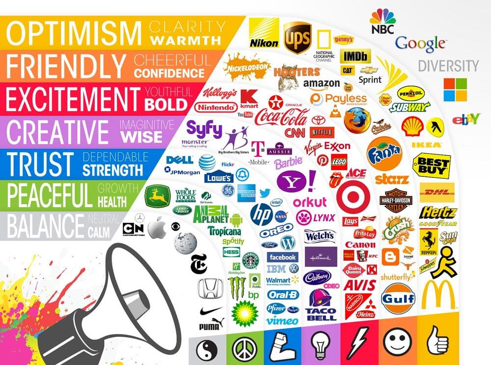
These comprise relatively sound depictions of the emotions that colours evoke, at least in western society.
It should be noted, however, that in Eastern cultures, there are different cultural responses to colours.
While white may mean purity and innocence in Western culture, it connotes death in eastern cultures.
Anyone who is considering localisation of websites and marketing materials in other parts of the world should conduct research and review colour changes based on those cultures.
General Tips in the Use of Colour Psychology
Gender Differences
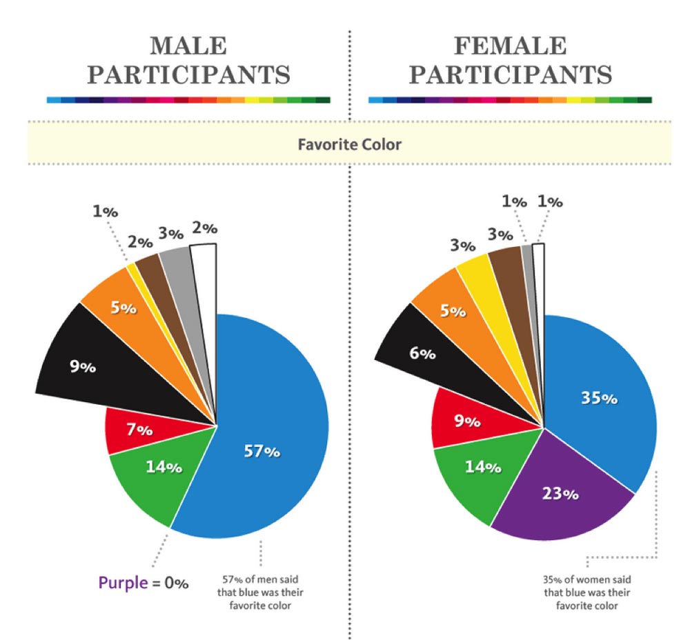
Yes, there are differences in colour preferences by gender. Women seem to like blue, purple, and green, as well as more pastel shades of colours. Thus, online magazines, female clothing sites, etc., tend to focus on these colours.
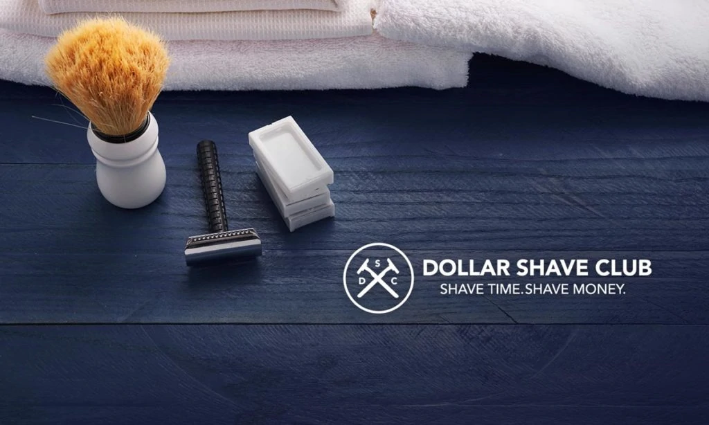
Men seem to prefer blue, green and black. However, do not take this generality to the bank just yet. Many masculine-focused websites are using colours the brown and orange and doing fantastic business.
Check out the Dollar Shave Club, for example.
Its rustic theme works.
Blue
Blue is what might be called a “universal” colour – one that may appeal to all age groups and demographics, in a variety of shades. Many marketers use blue because it evokes trust and intelligence.
There’s a reason why Facebook uses so much blue.
Green

Green often evokes feelings of money and wealth but also healing and fertility. Many websites use green.
Regions Bank is a typical example.
Sites like TreeHugger and Recycle Now also sport much green.
Orange
![]()
Orange is often emotionally associated with sunshine and joy. However, it also evokes feelings of success and confidence.
Sports teams often use various shades of orange (red-orange, bright orange, yellow-orange). Some neuroscientists state that this colour can increase the blood supply to the brain. However, it also evokes feelings of success and confidence.
Note how the logo of United Way incorporates orange into its logo, especially the figure with raised arms – a symbol of success.
Purple
Colour psychology associates purple with wealth and royalty. Because it is not often found in nature, purple dyes were rare in earlier times. Those who could afford to have clothing made of purple were wealthy.
Today, it also denotes wisdom and sometimes spirituality. Consider the popular Hallmark logo design:
![]()
The goal here is apparent: consumers should see Hallmark as the “royalty” in greeting cards.
Cadbury, the famous chocolatier in the UK, also has an image to portray – the most beautiful chocolate in the kingdom. Its website is filled with purple.
Red
Red is the colour of high energy, power, and strength, although it can also depict anger and danger. Websites with products for kids, such as Lego, use much red, along with other bright primary colours.
However, there is probably no other company that better depicts power, strength, and energy than Red Bull, from its logo to its website.
Colours of Wealth, Luxury, Sophistication
![]()
Looking at the websites of Rolex, Lamborghini, Cadillac, Gucci, and Cartier, you will see a lot of black, gold, and silver.
Black is associated with power, formality, sophistication, and elegance, although it can also evoke emotions of depression and evil.
Companies that do not offer products and services that are pricey and sophisticated should limit their use of black.
Gold has always been associated with wealth and luxury, while silver can depict the same, as well as grace and sleekness.
Yellow
In daily life, yellow often has the colour psychology of caution – yellow stoplights, wet floor signs, etc. However, it is also the colour of sunshine and can evoke emotions of joy and happiness and optimism.
It is a colour that is used a lot to grab attention, to depict happiness on sites with kids’ products.
Bright yellow is a great highlight colour to grab attention.
White
As mentioned, in Western society, white is most often associated with purity, cleanliness, innocence, goodness, and simplicity.
Most websites and marketing materials use white space to separate valuable content and to help to give substance, especially sites, a sleeker appearance.
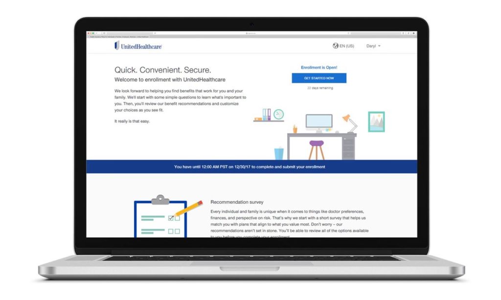
However, it is often used to promote products that marketers want to portray as pure and safe. The healthcare field often uses white. The official site of United Health Care is a prime example.
It is composed entirely of blue and white – blue for trust, white for goodness.
Colour Advice By Sector
Some colour analysts do try to recommend specific colours for specific business niches:
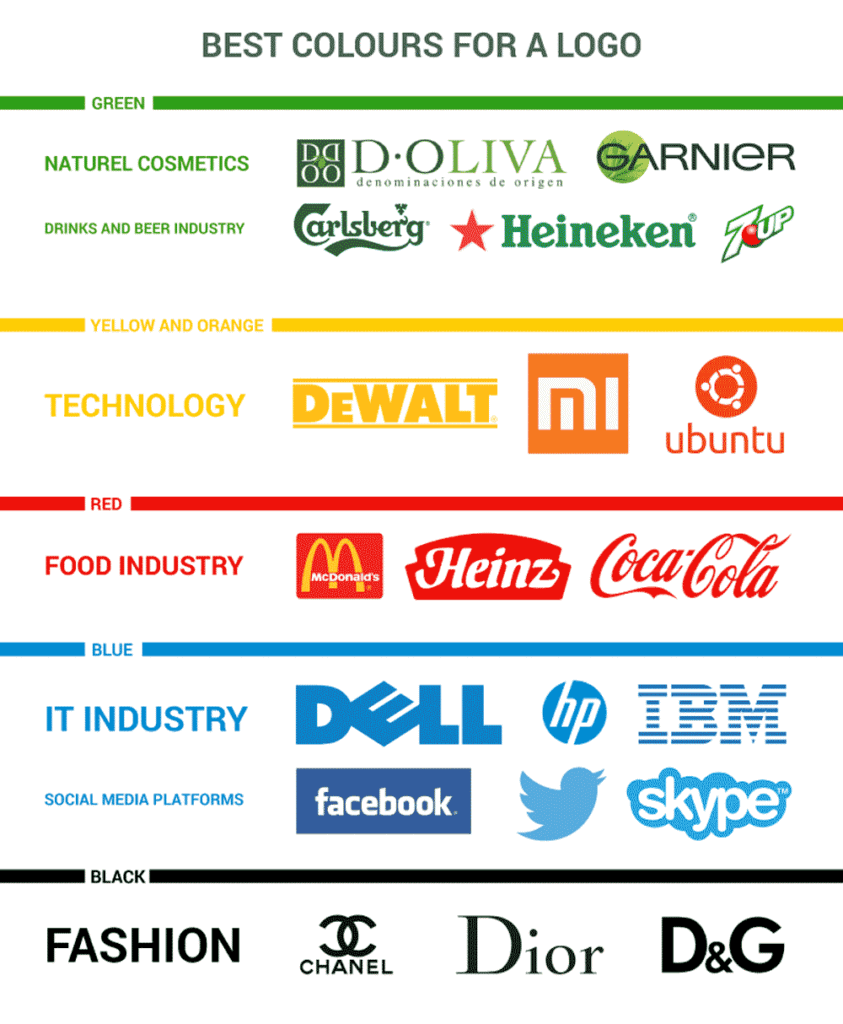
Yellow for food and drink, entertainment, children and child services (e.g., daycare).
Red for sports, entertainment, some fashion and cosmetics.
Green for sciences, financial services, tourism, and environmental organisations.
Blue for financial institutions, government, and organisation that rely on consumer trust.
Purple for spiritually-related and spirituality sites – tarot, astrology, Yoga, but also for prestige.
Orange for sports, entertainment, and education.
Black for luxury products, primarily cars, accessories, fashion
White for healthcare and medicine, high-tech charities.
It’s important to note that colour psychology is not an exact science.
It isn’t because individual colour tastes vary so widely.
Consider, for example, the vast array of colours and hues of clothing, furnishings, and other everyday items that consumers purchase, based on their tastes in colour.
Still, there are some general psychological triggers that specific colours do evoke, and designers and marketers should take note of these as they craft websites and marketing materials.
Moreover, the use of bright, contrasting colours for CTA buttons is effective.
The best thing that business owners can do is to understand their audiences and to test the use of colour psychology to determine which have a better response concerning conversions.
Colour Psychology and Its Impact on Customer Conversion in Ecommerce

In the modern age of technology and online marketing, it is an advantage for every business to use tools and tactics that can usher in the best results.
While most digital marketing strategies focus on content and search engine optimisation, it is just as important to consider your branding and website design.
We cannot talk about the latter without mentioning the power of the psychology of colours. It’s no secret that colours affect the way humans perceive things to the point of influencing their emotions and behaviour.
Using the right colours combined with the proper website and logo design can significantly influence how consumers identify and interpret sensory information, which leads them to form their impression.
Better impression and connection with your brand means more purchases, and more purchases mean higher ROI – all with the proper use of the psychology of colours.
When your target audience assesses your offer, they often base their judgment predominantly on colour. Customers make up their minds about whether to buy your product or service in 90 seconds. That is why it is imperative that you capture their attention as quickly as possible.
Here are some of the ways the psychology of colour can help you achieve higher ROI for your eCommerce business.
The Right Colours Help Boost Brand Awareness
Bringing your business online requires an excellent website that will allow you to showcase your offerings and attract potential customers.
But not just any type of website will do. You need to make sure that your company’s digital abode is attractive enough for your customers.
Brand recognition is essential, and your website is one of the places where you can reinforce this. Does its colour scheme match your brand logo and other visual identifiers?
Maintaining consistency and fluidity between these elements can help your potential customers recall your brand more efficiently while also providing them with a seamless visual experience when they visit your website and other online platforms.
How and Where to Include Brand-Related Colours

To enhance unique brand recognition, you should add brand-related colours in your business logo.
A logo is one of the essential parts of a company’s public perception, and it directly affects the way you communicate your message to your potential customers.
There’s no question whether or not you should invest in a well-designed logo that will become the face of your eCommerce business.
Aside from the logo, your website is the next thing your customers see when they decide to make a purchase. And this is yet another platform that enables you to enhance their purchasing desire and increase your ROI by using the psychology of colours.
If you run an eCommerce business, you already know the importance of social media platforms for brand awareness and promotion.
Make sure to include the dominant colours of your brand on your social media wherever you see fit – headers, typography, profile pictures, and posts.
The Right Colors Influence Human Behaviour
Sale
The Complete Color Harmony, Pantone Edition: Expert Color Information for Professional Results
The Complete Color Harmony: Pantone EditionEiseman, Leatrice (Author)English (Publication Language)216 Pages – 10/24/2017 (Publication Date) – Rockport Publishers (Publisher)
−$8.46
$16.53
Colours influence heavily the way your potential customers organise, identify, and process sensory information.
It is said that colour impression determines 60% of the acceptance or rejection of a product. Many consumers look at colour when making up their minds about a purchase.
One of the most prominent examples of how colour influences buyer behaviour is the marketing experiment conducted by Heinz.
The company changed its signature ketchup from red to green, leading it to sell over 10 million bottles in the next seven months, which amounted to $23 million.
The Right Colours Can Help Convert Customers Faster

In the modern age, most business websites take advantage of call-to-action buttons to boost conversions.
Whether you aim to grow your email list or increase your sales, having an active CTA button on your website can make a world of difference. But where does colour come into play?
CTAs must stand out from other elements on your website, which is why it is considered good practice for the buttons to be brightly coloured, with orange and red being popular choices.
There is a distinct correlation between CTA button visibility and conversion rate increases.
Finding the right colours for your brand takes time and patience. You need to conduct thorough testing and perform constant monitoring to ensure that you are getting the most out of the shades you’ve chosen.
Now that you know the power of colour psychology, it is time to get to know which colours will give you the best results. Here are some of the most popular colours in marketing and branding and their uses.
Red for Excitement
Dubbed the most emotional colour, red has a way of eliciting feelings of excitement, increasing the heart rate, and creating a sense of urgency—no wonder this colour is often used in clearance sales.
The colour red is popular in the food industry with brands like Coca-Cola, McDonald’s, and KFC leveraging its potential.
Pink is for Romance
Feminine and romantic, pink is often used in shops that are focused on selling products like perfumes and lingerie.
Women, especially young girls, tend to love pink, as it gives them a sense of comfort. Cosmopolitan, Hello Kitty, and Barbie merchandise are the prime examples.
Purple is for Luxury
Hallmark is only one example of how purple colour, in contrast with yellow, can help people associate a brand with feelings of luxury.
Aside from it being the traditional colour of royalty, purple can also be used to indicate honour, courage, and leadership. It’s popular among PR and design agencies, as well as with spiritual groups.
Blue is for Trust
A cool colour, blue is a popular choice for many of today’s websites and brands. Social media platforms like Facebook, Twitter, and LinkedIn use this colour in their logos and sites.
The same is true of Skype. Blue communicates a sense of security to clients, making it an ideal colour for brands in the finance sector, such as PayPal and VISA.
Green is for Harmony
Often found in energy, finance, food, household, and technology sectors, the colour green takes inspiration from nature. It is a symbol of growth and harmony.
That is why many businesses utilise this colour in stores to help customers relax. Some of the notable brands using the colour green include Spotify, Animal Planet, and The Body Shop.
Orange is for Enthusiasm
Brands like Nickelodeon, Hooters, and Fanta recognised the potential of orange as a brand and marketing colour a long time ago.
It is also quite popular in the healthcare and technology industries. But the most critical effect of orange is its capability to inspire enthusiasm and confidence.
That is why many websites use the colour orange for their call-to-action buttons to compel customers to take action, such as buying a product or subscribing to a mailing list.
Yellow is for Optimism
Yellow is the most prominent colour for the human eye. Often associated with warmth, sunlight, and youthfulness, it is used to grab the attention of window shoppers and prompt them with a sense of optimism before they explore the store.
Ikea and Best Buy use the contrast between yellow and blue to draw in their customers.
Brown is for Safety
A natural colour that evokes a sense of strength, reliability, and resilience, brown is used to evoke feelings of warmth and comfort.
For example, UPS is one of the famous brands that use brown in its logo.
Black is for Authority
Elegant and powerful, black is the trendiest choice for marketing many luxury products, from Jaguar and Mont Blanc to Chanel and Louis Vuitton.
Indeed, there is something dignified and sophisticated in the black colour. It also conveys power and stateliness.
White and Silver for Perfection
If you want to send a message of cleanliness and coolness, there is no better choice than silver and white.
Just look at the brands that have been using it, including the likes of Apple, Ralph Lauren, and Honda.
White and silver are standard in agriculture, aeroplane, household, energy, and technology industries.
Summary
Communicating the right message to your customers can be enhanced with the clever use of colours that fit your brand.
That is why it is vital that you match your brand to the hues that best reflect your brand personality and evoke the right emotional response.
Start utilising the psychology of colour to achieve what you are aiming for—more customers and higher conversion.
In eCommerce, humans use vision more than any other sense, simply because they can’t touch or taste the product.
Potential buyers rely on the sense of vision to guide them while they surf online looking to purchase goods.
However, they also hope that a brand or a product will draw their attention and that they will find what they were looking for.
Meeting them half-way and offering a clear statement about your brand and products of services by using the psychology of colours can push them toward the right purchasing decision.
In return, this will result in a higher ROI for your eCommerce business, allowing you to invest in reaching even more customers.
 Top 10 Creative App Design Trends That Dominate 2020Read More
 The Ultimate Guide to Colour Psychology in BrandingRead More
 How Graphic Design Contributes to Better BrandingRead More
 B2B Sports Events Marketing Strategies in 2020Read More
 Ultimate Content Marketing Strategy – Guide for 2020Read More
 The Role and Importance of Communication in MarketingRead More
The post The Ultimate Guide to Colour Psychology in Branding is by Stuart and appeared first on Inkbot Design.
Read more: inkbotdesign.com