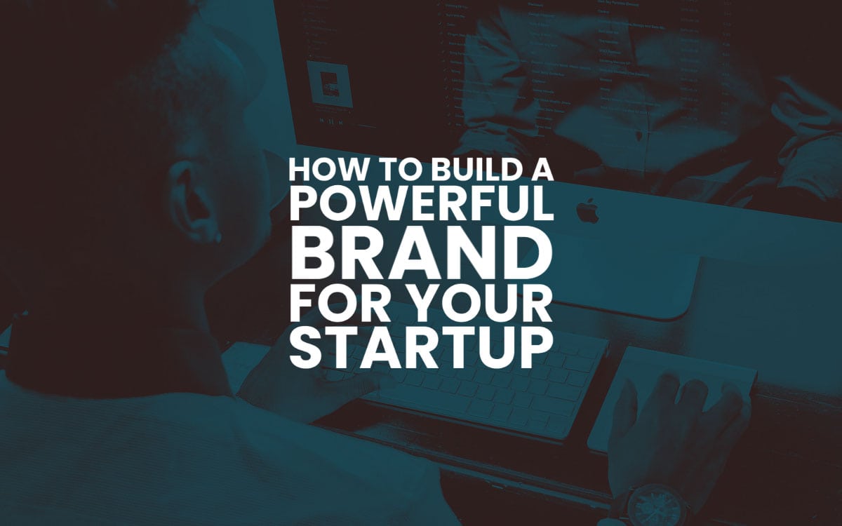
How to Build a Powerful Brand for Your Startup
If you’re a designer with your own business, there’s a good choice you’ve thought about the concept of a “brand” at some point.
After all, to build a powerful brand is the ultimate goal of anyone starting a company.
However, have you sat down and actually thought about what a brand is and how it can be developed?
A brand is essentially a representation of a company’s values, purpose, aesthetic, passion and place in the world.
Jeff Bezos, the founder of Amazon.com, once summed up brands succinctly and effectively by saying, “Your brand is what people say about you when you’re not in the room.”
Brands create connotations and reputations about companies for consumers.
They help people envision just what a company is all about and whom they intend to serve.
Branding isn’t just a fun chance to create images and sayings that get to be associated with your company.
In fact, effective branding is extremely important when you build a powerful brand, and how well a brand is designed can make or break a company’s success.
Did you know that 85 percent of consumers will choose a known brand over an unknown brand when making a first-time purchase of an item or service and that companies with strong brands outperform companies with weak brands by 20 percent?
The Basics of Branding
There are many components that make up a company’s brand – including a motto or tagline, and the tone and language used for its written content.
However, perhaps the most important part of a company’s branding is its logo.
A logo is essentially a recognisable visual representation of a company, which serves as a sort of shorthand to tell people what the company is and what they’re all about.
Logos should be immediately recognisable and memorable, and they should ultimately serve as a symbol for all of the associations that a consumer has about a business (both positive and negative).
Studies by researchers at MIT’s Sloan School of Management revealed that good logos are powerful: they can not only boost the positive connotations of a brand among consumers, but they can also help companies perform better financially.
So, if you’re convinced that brands and logos are powerful and important, you may also be wondering just how to design a brand for a startup that works and sells.
The following advice about how to design a logo can help ensure that you build a powerful brand image that both effectively represents a new company, and also resonates with the consumers that see it.
Building a Brand and Logo
If you’re planning to design a logo for a brand new company, there are some simple steps to take that can get you from the brainstorming phase to a beautiful, effective logo that your client loves.
1 – Adopt the Designer Mindset
![]()
The first step in creating a logo for a startup is stepping into the right designer mindset.
When creating a logo, you have to remember: you are designing for your client’s clients – not the client themselves.
In order to get some good initial ideas about what the logo should look like, develop a clear idea about who the logo is meant to appeal to.
To do this, ask yourself the following questions:
Who does this company want to appeal to?What other brands are they drawn to?
To help you get an even better idea about who your client’s clients are, it can help to build in-depth audience personas.
To build audience personas that help spur the creative process, answer all of the following questions about who you’re trying to attract:
How old is your target audience?What are their hobbies?What cultural points-of-reference do they share?What do they do on the weekend?What do they do for work?Etc.
Once you’ve answered these questions, you may find it easier to hone in on just what kind of visuals will appeal to the right people.
As marketing expert Neil Patel explains, “As you build the profile of your target audience, you’ll get inside their head and figure out their motivations.
This is important because, as we said earlier, when you know what this person’s motivations are, you can help them achieve their goals as a way to achieve your own goals.”
2 – Discover Your Brand’s Aesthetic
Once you’ve figured out who your logo is going to need to appeal to, you need to determine the brand’s overall aesthetic.
Brand consistency across all channels is important since it takes five to seven visual impressions for a person to imprint a brand in their memory.
So, if the logo is the first design asset you’re creating for a startup, the aesthetic you choose for it is going to be used throughout all of the rest of its marketing materials: from email headers to product packaging, to website designs and more.
In order to discover your brand’s aesthetic, look at the audience personas you created above.
Then, think about what look and feel those specific people would enjoy and be drawn to. Here are some tips for getting at the right aesthetic:
Analyse the tone of your content. Think about the heart of what the company does and the tone of that content. Are they a funny company with lots of colourful activities? Or is it a very serious business? Does the company evoke a feeling of serenity? Or is it bustling and energetic? A tone analysis will help you start getting at visual elements that make sense.Use mood boards. Moodboards are an effective way to start visually seeing how to build a powerful brand identity. They help you easily link aesthetics to feelings. On your mood boards include images whose content match the mood and tone of the company. You should also include images with typography that has the right feel, as well as those with the right colours in them. When you’ve finished a mood board (or several), take a step back and look at their overall visual aesthetic. You can use an online mood board-specific tool like Canva to create your boards, or simply use a platform like Pinterest. This will help you get a sense of what a company’s logo should look like.
3 – Start Designing
The next step in the logo design process is to put pen to paper (or finger to the trackpad). When you start designing your logo, it’s essential to keep the five key aspects of logo design in mind.
Style: Use the mood boards you created above to choose the feeling you want to transmit. This is the overall style of the board. Special elements: Are there any special or specific symbols that hold particular importance to the company you’re designing for? For example, if you’re designing for a jewellery company that specialises in engagement rings, you may want to focus on the diamond ring as a special design element.Colours: Logos should almost always use two colours. The primary colour used in the logo design should be vibrant, while the secondary colour in the logo design should be more muted.Fonts: Fonts are an important part of a logo design because fonts actually have a psychological impact on the people that view them. In fact, according to David Dunning, a psychologist who studies typography, “Fonts have different personalities” — and those personalities are transmitted when people take in designs. Each logo should have two fonts, at most. The primary font in a logo design should be ornate and recognisable, while the secondary font should be complementary and simple.Composition: The composition of a logo comprises how you arrange the logo elements. While there are no hard and fast rules to composition in logo design, there are several best practices, including using no more than three elements, choosing one element to be the clear focus and arranging in grey at first (you don’t want colours to distract you from getting to a composition that actually works).
4 – Choosing the Right Colour for Your Logo
![]()
All five of the key aspects of logo design are important, but one is particularly essential because it has such a psychological impact – and that element is colour.
Choosing the right colour for your brand is key since colours evoke emotions and feelings, and the colours of a logo can immediately make a person feel a certain way about a company.
They can also be an influencing factor when a consumer is trying to decide whether to buy.
Studies show that 84.7 percent of people cite colour as the primary reason they choose to buy a product, and 80 percent of people believe that colour increases brand recognition.
If you’re looking for inspiration for logo colour ideas, there are several resources that can help.
Pinterest: Search Pinterest for a subject related to the company you are designing for and see what image speak to you and what colours you are drawn to in them. Alternatively, look at the Pinterest boards of other logo designers: their inspiration may inspire you also.Colour Pickers: There are several digital colour tools, like Adobe Color CC, that can help you pick the right scheme for the brand. Select colours from images that you like and create your own customised colour palette. Don’t be afraid to try a few different colour schemes out: you may want to start monochromatic and then choose complementary or analogous colours.Colour Psychology: Learning a little bit about colour psychology can also help you decide what colours are just right for your logo. Here’s a quick rundown of the most common feelings that are associated with each colour:
Red: rage, anger, and annoyancePurple: loathing, disgust, and boredomBlue: amazement, surprise, and distractionGreen: acceptance, trust, admirationYellow: serenity, joy, and ecstasyOrange: interest, anticipation, vigilance
To ensure you’re picking the right colour for the company, try to make a list of adjectives you’d want your client’s clients to feel when they see your logo.
Do you want them to feel calm and reassured, or should they feel excited and amped up?
Look at this list and see how it aligns with the psychological effects that popular colours have.
5 – Pulling It All Together and Build a Powerful Brand
Once you’ve picked a style, incorporated special elements, chosen the right font and arranged your logo, you can add the colours you’ve chosen to the composition (one brighter, bolder primary colour and one more muted).
When you’re tweaking your logo to its final version, be sure to think of sizes and colours as control regulators.
Both colour and size can be used to draw attention where you want (and take it away from where you don’t want).
Also, don’t forget to reinforce the main element of your design with the primary colour you’ve chosen.
If you’re designing a logo for a company, it’s important to put careful thought into your creation.
After all, a logo sets the aesthetic tone for a new company, and it also can help make or break its financial success.
If you want some help getting started creating a logo for a new brand, consider checking out logo templates.
Pre-made logo templates ensure that the arrangement of the logo is visually pleasing and effective — and all you have to do is customise with your chosen colours and special elements to make it a logo all your own.

The post How to Build a Powerful Brand for Your Startup is by Stuart and appeared first on Inkbot Design.
Read more: inkbotdesign.com