Editor’s Note: To say that advertising on Facebook has become a revenue juggernaut is the understatement of the year. Facebook ads have become ubiquitous, and are a core element of the marketing budget for many brands. Eugine Dychko discusses the art and science of creating effective ads on Facebook, focusing on the visual elements that work best in these ads. Ever the researcher, I especially like the discussion of A/B testing she includes at the end.
Facebook should be right at the crux of your marketing strategy. According to a report by Social Media Examiner, 93% of all marketers use Facebook as a means of advertising. As staggering this number is, it shows Facebook’s potential as a “fertile soil” for marketing.
Sadly, many brands see their Facebook ad campaigns falter for one reason in particular – bad utilization of images. The right visual content does wonders for your brand, but how can you pick the right image and be sure of its success?
In this article, we will cover just that. The following sections discuss how to pick the right images for effective Facebook ad campaigns.
Be Up to Date
Lots of brands strive to do everything perfectly. They target their campaigns in a flawless manner and invest more than enough. Still, success doesn’t come, and they’re stuck with the same old click-through rate. Why is this the case?
Outdated images might be the reason. Just like in every other industry, visual trends change frequently.
If you wish to boost the efficiency of your Facebook lead ads, you need to follow trends and know what your customers want.
Tools Are the Pathway to the Right Images
Thankfully, there are lots of tools that can help you design and utilize trendy images. Some of them also provide templates made by professional designers who follow the latest trends in graphic design. You can look at some of what we use at Crello as an example to get a feel of what it means to work with such instruments – and even create some animated Facebook ads.
Here are three reasons why using design tools can help you improve the efficiency of your campaigns.
Following trends sends a message that you care about providing the latest and greatest ad services to your customers
By knowing what’s going on in your niche, you get more ideas and can run more campaigns
More fresh content improves your online presence and helps build brand awareness
Unfortunately, being up to date is not good enough sometimes. It’s just one facet of picking the right image. As a marketer, you need to know the specific details that work with your audience. In the next sections, we will cover some specific characteristics of efficiency-boosting Facebook Ads.
Pick the Right Shape and Size
Facebook lead ads do contain text and the meta description next to the actual image. However, the right image has to be the right shape. The first rule is that you should pick a landscape-oriented image, each and every time.
Since Facebook publishes ads in a rectangular shape, you have to fill the space with a landscape image. Empty space will affect the success of your ads negatively.
As for the size, Facebook officially recommends images to be 1200×600 pixels. However, even if you pick a lower size, it doesn’t make such a difference. The only time you need to include a bigger image is when there is a lot to be included in the image.
Cover the Ad Space Wisely
The Facebook Ad image is quite small. So you have to utilize the space available in the most efficient fashion.
Avoid using text. The image is small and inserting text will only tire people’s eyes. Whatever you can get across using colors and shapes – do it. A two or three-word call to action is the only thing you should use. A CTA does not have to be very suggestive either. Anything that is salesy has a high chance of being ignored by the viewer.
Have only one central theme of an ad. Too much content increases the time needed to get your message across. If you’re running a campaign with ads that are bigger (marked as recommended on the Home Page), you can utilize multiple objects.
Never pushing anything close to the borders of the image. It will create confusion, and people won’t be able to discern what’s pictured.
You can choose to use your logo strategically in the ad. For example, Heal has used it wisely once as the main ad logo and then also on the person’s coat. That’s simply 2x the chances that you create for brand awareness.

Colors
Facebook boasts a blue and white color scheme so using these two colors together is out of the question. Making this mistake will cause your images to blend in with the surroundings. Instead, use colors that jump in.
An ideal choice is to pick an image with a strong, bright color that is easily visible. Here is an example of successful ads that utilize great color combination so that its colors do not blend with Facebook’s blue and white.

If your image has multiple colors, make sure they are contrasting. This makes them more visible. If you’re unsure about which colors to use, check out this convenient Color Wheel. It allows you to pick one color and find it’s complementary contrasting hue.
Use People’s Photos, if Possible
Popular companies like Nike, McDonald’s, H&M and, Adidas all run Facebook Ad campaigns successfully. Of course, they pick the right images thanks to one important detail: They all feature people. Adding people to your Facebook Ad images gives your campaigns a human dimension.
Animated Images
Animated images are also a great way to boost the efficiency of your Facebook ads. By including a GIF or cartoon images into your campaign, you will utilize all the benefits of video marketing, but without using too much time.
Value Proposition
The key to creating an efficient image for your Facebook Ads is the value proposition. In this case, it isn’t just about the image – you’re going to have to utilize text as well. Give your customers an enticing visual representation of the product and use “value” words.
Limited, free, discount, excellent offer, don’t miss it – all of these words will work together with the image and create an excellent value proposition. Once people see the full benefit of your ad, they will find it more interesting and click on it.
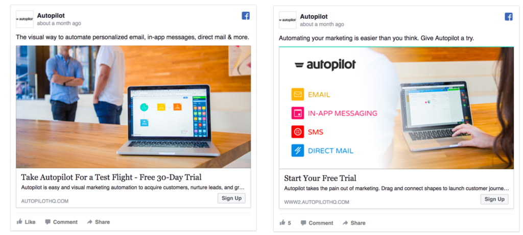
Check out the difference here in this ad. The overall ad element and variations in text and image differ and might appeal to a separate set of people differently.

Never Forget to Test
Even if you think you’ve chosen the right image, there is always a possibility that will fail. Oftentimes, you may come with several good images for your Facebook ads. To easily solve your dilemma, A/B test your images to see how they perform against each other.
For instance, there are stats supporting the “animated ads are more effective than still image ones” hypothesis, and there are stats that prove the opposite. Thus, in the case of AdEspresso, their test took an unexpected turn, when the still image outperformed the animated image by 38.2% in terms of CPL.
And there is no contradiction here since a one-size-fits-all solution is non-existent. At Crello, we decided to check what works best specifically for us and run an experiment with advertising our guide on 100 free marketing tools. It has been expected to bring us new leads by making Facebook users interested in subscribing to our blog. It turned out that the animated ad performed 1.5x better by generating 325 clicks against 145 clicks we got from the still image ad. Worth mentioning, that the latter reached more users and still appeared to be less effective.

Another company, which zeros in on another audience, might get other results. And there is no other way to find out if it’s your case rather than running your own tests.
Concluding Thoughts
So, it turns out creating high-performing images for Facebook lead ads is not that difficult, time and money consuming. By knowing what people like, you can appeal to them and improve your click-through rate. Stay creative and never be afraid to come off as unique or different. Originality is a never-ending trend in digital marketing, and people will appreciate it.
Read more: greenbookblog.org
