The success of your customer onboarding flow relies heavily on the first few touches, and it starts with your welcome email.
What is a welcome email
A welcome email is one of the first impressions your brand makes. A friendly hello to connect with new customers and encourage them to interact with your product or service.
Your welcome email should be informative, clear and actionable. The examples in this post cover a range of approaches. Some might work great for your business, and others might not. Testing, as always, is highly encouraged.
Why welcome emails are important
One important thing to remember, open and click rates do not measure the success of your welcome email.
Of course, you’ll want to tweak subject lines and body copy to optimize conversion. But the real purpose of the welcome email is to move users through your onboarding process.
Welcome email statistics
The average open rate for a welcome email is 50%. That makes it 86% more effective than standard newsletters.
76% of people expect to receive a welcome email immediately after subscribing to your list.
Users who receive a welcome email show 33% more engagement with the brand
Source:invesp
The next step, depending on your software, blog or store could be to encourage readers to:
complete their profile
download content
read a help doc or guide
login to their account
make a purchase
complete a task/action
Whatever that step is, it must deliver value.
The metric to measure is the conversion rate. How many people took the step you asked them to take?
With this in mind, let’s dive into some of the best welcome email examples.
Jump to:
Airbnb
Allbirds
Asana
Away
Casper
Eve sleep
Evernote
Grammarly
Headspace
Helloprint
Invision
Marvel
Medium
Mode
Moo
Pipedrive
Starbucks
Tripit
Turo
UGMonk
Unsplash
Welcome Email Examples
Airbnb
Subject line: How does Airbnb work?

Uncertainty is a conversion killer. New users usually want to know how your product or service works before diving in. Airbnb’s welcome email alleviates anxiety by providing clear guidelines on how things work.
It provides you with a clear introduction to their features:
find a home
explore experiences
travel with confidence
become a host
All sections are visual, showing people having a good time. Descriptions are concise and actionable, with relevant CTAs.
Instead of using a CTA asking people to “Book Now,” the CTA prompts them to “Explore.” It’s non-committal and friction-free.
Subject line: Welcome to the Flock
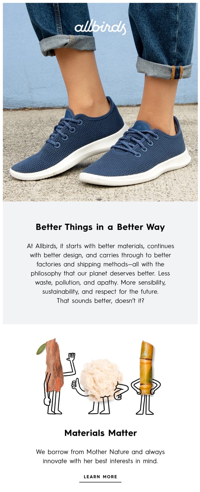
Allbirds, the world’s most comfortable shoe brand, creates a special feel that’s visible at every point.
Allbird’s welcome email:
uses colorful language to convey values
includes subtle animated GIFs that are consistent with the overall welcome email layout
starts with an outstanding subject line: Welcome to the Flock that builds on the brand’s playful, friendly tone-of-voice, while making you feel part of something
Together, all these elements make for an authentic and memorable brand identity.
Well done, Allbirds!
Subject line: Welcome to Asana
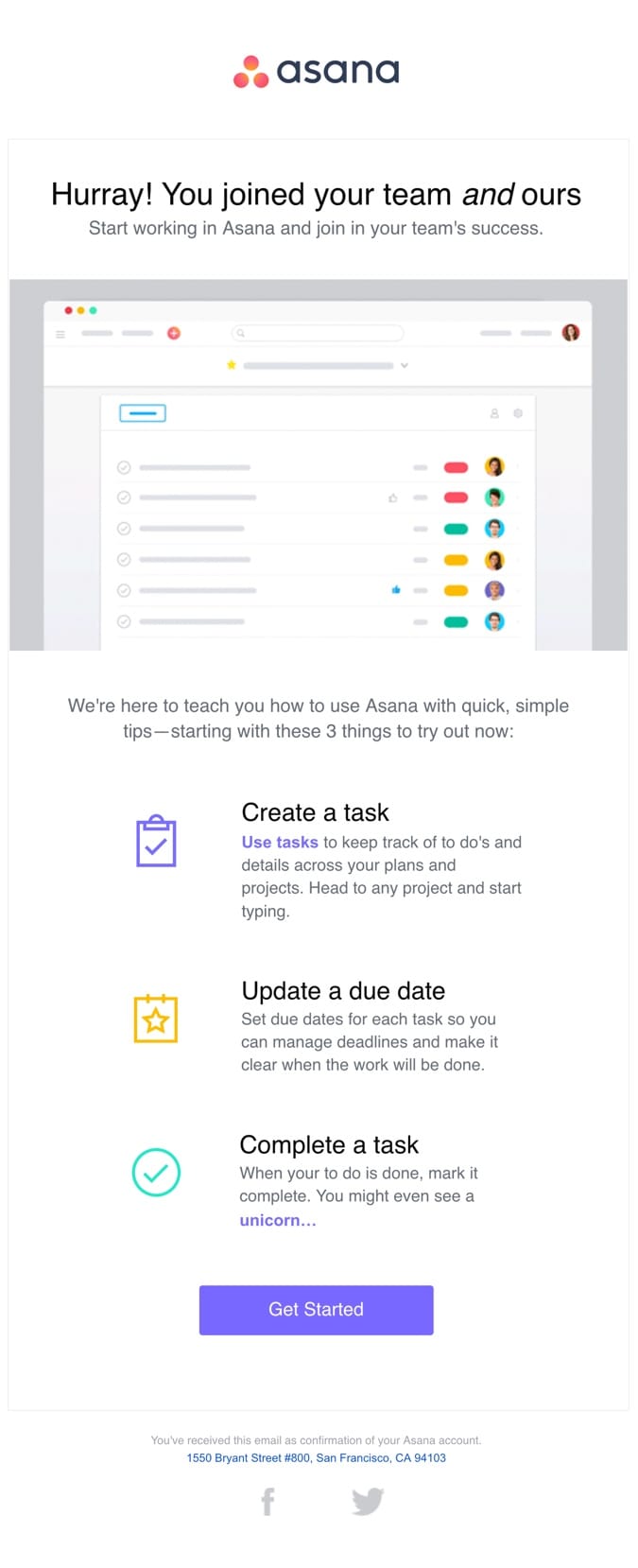
Asana’s welcome email design aligns with their product, which is great for their overall brand recognition.
Messaging is tight and focused, making the next steps clear for the subscriber.
“Three things to try out now” makes it easy for the customer to get started, and quickly gain value from the product. Also, they have actionable headlines that are short, but to the point.
Plus, a vibrant purple CTA button looks awesome and beautifully contrasts the overall layout.
Pro tip: The 1-2-3 formula is great for welcome emails as it makes it simple for readers to digest. When done well, it even reduces anxiety about using a new product.
Subject line: We’re Away. Let’s meet up.
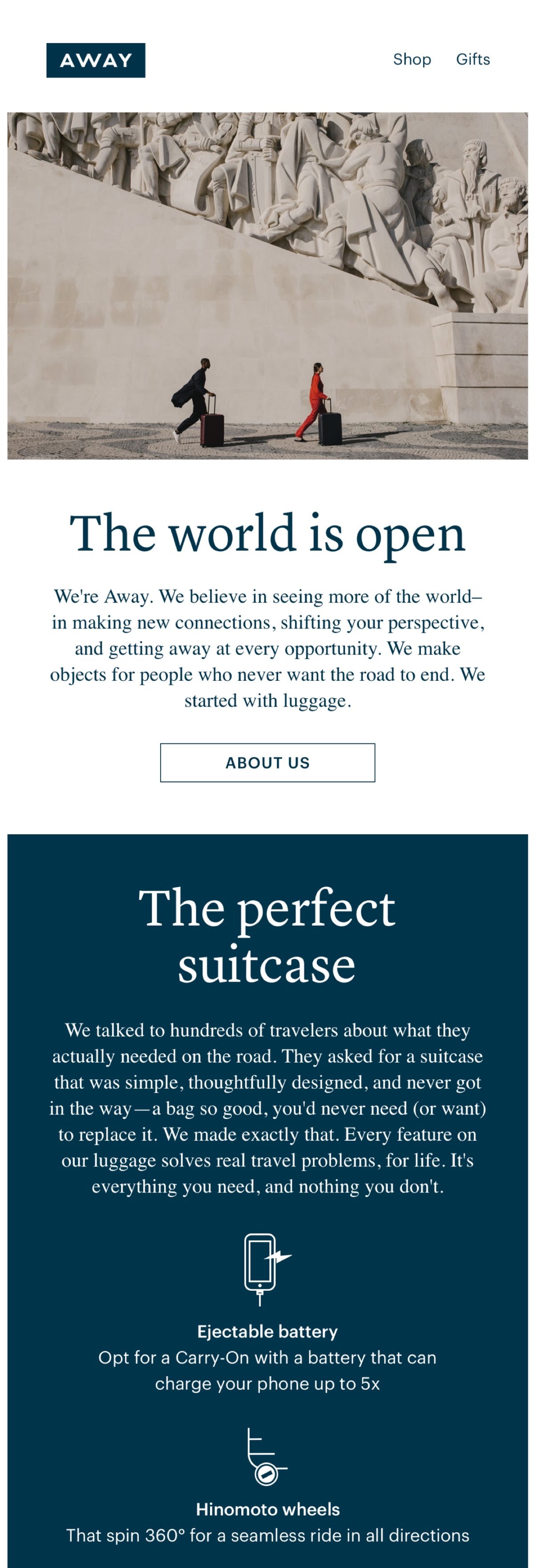
Away, the first-class luggage brand uses a welcome email to describe and share their values and authentic passion for travel. And right from the start, they demonstrate customer-first approach by talking to travelers about what they needed on the road.
Away’s welcome email gives you five strong benefits and reasons to choose their product, reducing anxiety by offering a 100-day trial. Also, the narrative makes Away’s luggage feel thoughtful and bulletproof.
This welcome email lines up with the company’s brand image and inspires you to the next trip.
Excellent storytelling!
Pro tip: Not all your recipients are already customers. For this reason, they might need a little more background about your brand to start trusting you.
Casper
Subject line: Welcome to Casper!

Casper welcomes us with a beautifully designed email. Perfectly matched night colors and sleepy language creates a relaxing aura around the brand. 🙂
They use awards to prove the quality of their products and earn your trust.
Casper’s welcome email suggests the involvement of some high-tech stuff and that they take your sleep super seriously.
Also, the 100-night trial reduces the barriers to purchase, it feels less of a commitment, and they can change their mind, so the decision to buy is easier.
“Let’s get sleepy” is a hilarious CTA that aligns with the copy, implies action and it’s always great to see something fresh! 🙂
Subject line: You’re part of the family now
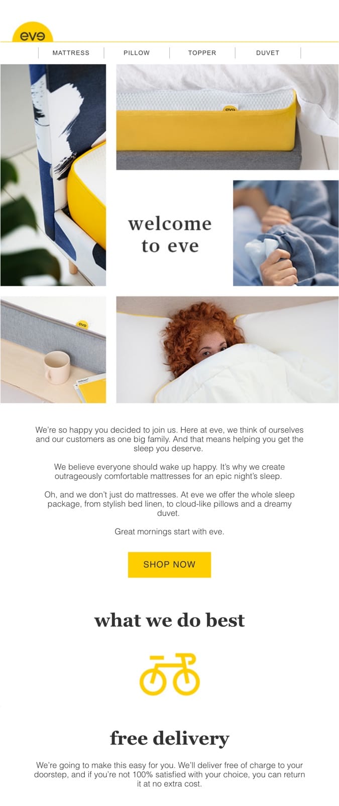
While this subject line makes it immediately feel like you belong here, the opening statement helps establish the brand as human and caring, with a greater good and purpose.
We believe everyone should wake up happy. It’s why we create outrageously comfortable mattresses for an epic night’s sleep.
After a statement like that, nothing else matters; you know you’re at the right place to get your perfect mattress! 🙂
Eve goes straight to the most significant benefits their products bring: waking up happy, accompanied by an epic night’s sleep. That’s a great emotional hook!
The introductory paragraph is crowned with a classic CTA, “shop now.”
With such an awesome and creative paragraph, it’s okay to keep your call to actions simple.
The second part of the welcome email offers perks that help bring the reader closer to making a purchase:
Free delivery
100-night trial
10-year warranty
Eve not only offers a quality shipping package but they also make it super comfy.
Your experience is going to be nice and smooth. 🙂
No frustrations, no trouble.
Subject line: Welcome to Evernote!
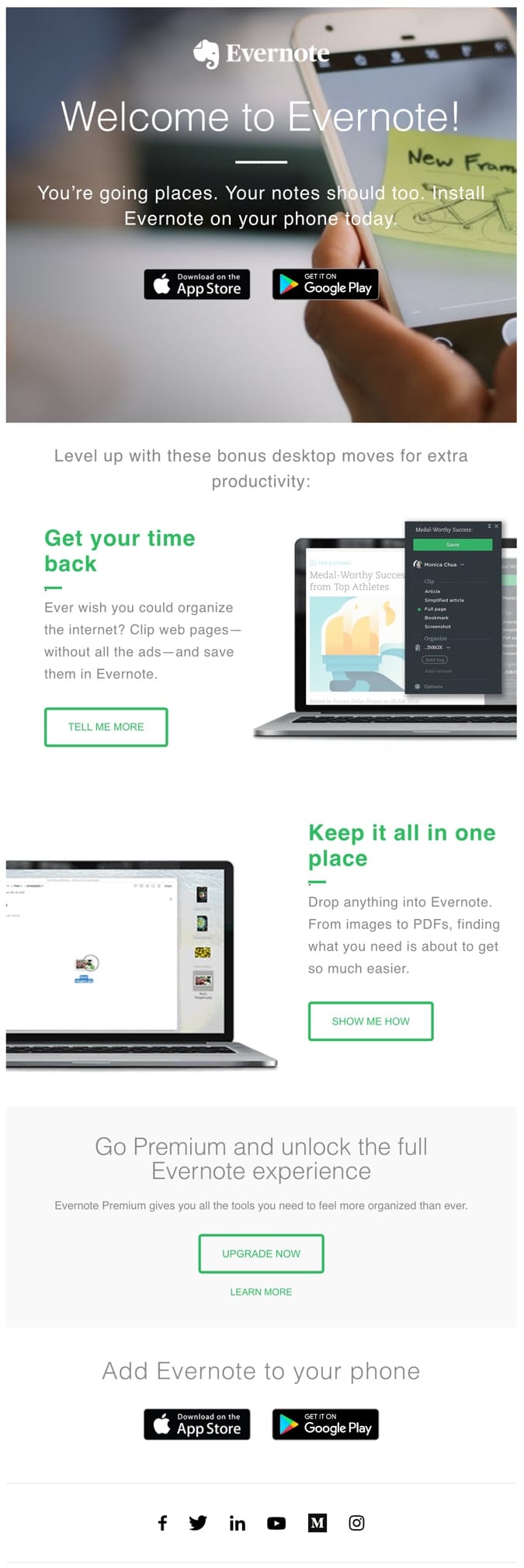
The opening statement in Evernote’s welcome email caught my eye:
“You’re going places. Your notes should too. Install Evernote on your phone today”
It’s concise, clear and tells you the action you’ll need to take to enjoy the benefits of this excellent note-taking app.
Evernote keeps its copy short, light and to the point, telling new subscribers:
How to download the app.
How to use it to improve productivity efficiently.
It’s the right thing to do since email attention spans are short – about 11 seconds, according to Litmus research.
Pro tip: Optimize your emails for short attention spans. Use heads, subheads, bullets, and other tactics to communicate quickly.
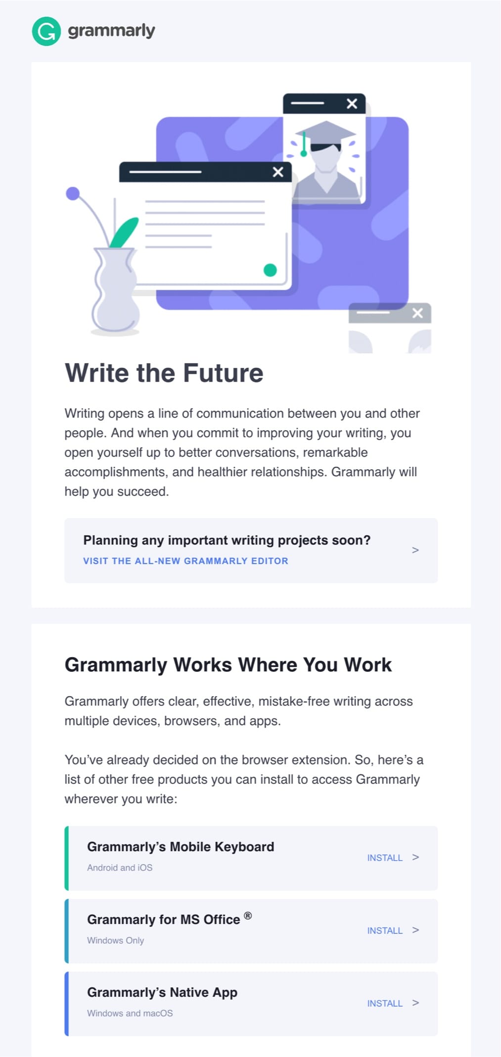
Subject line: You + Grammarly = Ready for Action
Grammarly, a free writing assistant, has been nailing their online communication.
They know exactly how to use online channels to make you fall in love with their personality. And with witty, playful language, Grammarly gets right to the point.
Write the Future. This is how their welcome email begins.
“better writing opens you up to better conversations, remarkable accomplishments, and healthier relationships”.
That’s a broad perspective, but when you think about it – there’s a lot of truth to it. That’s an excellent analogy. 🙂
The three following sections guide you through Grammarly’s basic features to help you get started and gain value quickly.
Pro tip: Develop a friendly consistent tone-of-voice across all your communications to make your brand engaging and memorable.
Subject line: Ready to meditate?

Headspace, a guided meditation app, created not only a great product for a happier, healthier life but also mastered mindful storytelling.
And their animations rock!
Headspace’s welcome email template is something to see because of its cartoonish brand style. They use illustrations to provide interesting meditation lessons and define their brand identity.
This welcome email example:
tells you exactly how the trial works
uses a strong lead magnet (free 10-day beginner course)
explains what happens when you want to go beyond the basics of meditation
One thing that’s missing here is a second CTA button located at the bottom of this welcome email – So you don’t need to scroll back to start meditating.
Subject line: Hi Kasia, let’s get you started.
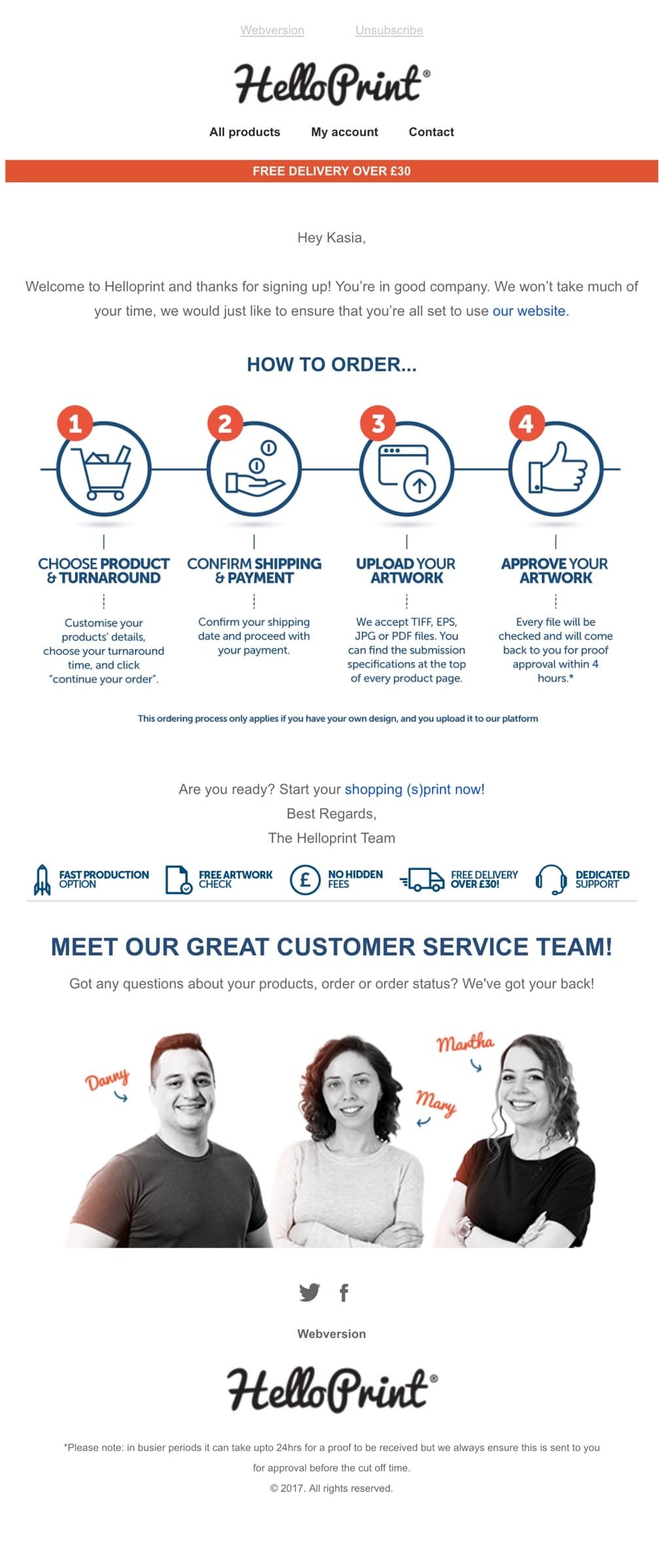
Helloprint’s welcome email is a beautiful example of making the brand feel human, warm and welcoming through an introduction to their support team members.
Helloprint stops being anonymous and you know precisely that it’s Mary, Martha, and Danny taking great care of you.
It’s a simple move to immediately put a face to your brand, making it friendly and personal from the start.
Pro tip: Introduce your team to your users to make your brand more friendly and trustworthy.
Invision
Subject line: Welcome to Invision

Invision’s welcome email is all about showing, not telling. They provide three handy videos to help you understand and make the most of your Invision experience.
Highlighting that their customers include well-known brands and experts who are admired for their design and customer experience, helps to establish trust and credibility with the reader quickly. This, in turn, encourages the customer to use the product.
Clear and actionable copywriting drives your attention towards Invision’s value propositions and benefits, showing the customer what they can achieve with the product.
This simplistic and visual approach aligns with the narrative and the essence of the overall product.
Subject line: Kasia, let’s get you designing in Marvel
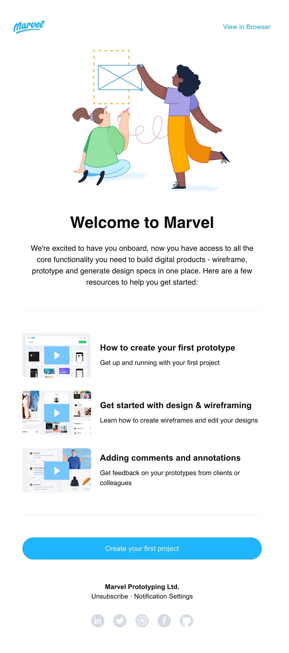
Marvel’s welcome email combines illustrations with short, informative video tutorials and simple, personalized copy to drive you towards useful resources.
This welcome email keeps you focused with a minimalistic and clean design.
Subject line: Welcome to Medium, Kasia Perzynska

Medium greets new members with a light, clean welcome email design and pastel colors.
The conversation opens with a simple, yet powerful statement:
“Welcome to Medium, where words matter”
This works to convey Medium’s central idea from the start. Next, you are served Medium’s fundamentals:
who the platform was created for
the primary idea behind it – to provide users with hyper-personalized content
how you can get unlimited access – $5/mo
Messaging is concise and tells subscribers how the modern content platform works.
Beneath, you’ll find some personalized stories based on the topic selection, plus top-performing stories to capture your attention and get you reading straight away.
Pro-tip: Make your welcome email as personal as possible to deliver content your users will value. Track your event data to add dynamic content to your emails.
Subject line: Welcome to Mode!
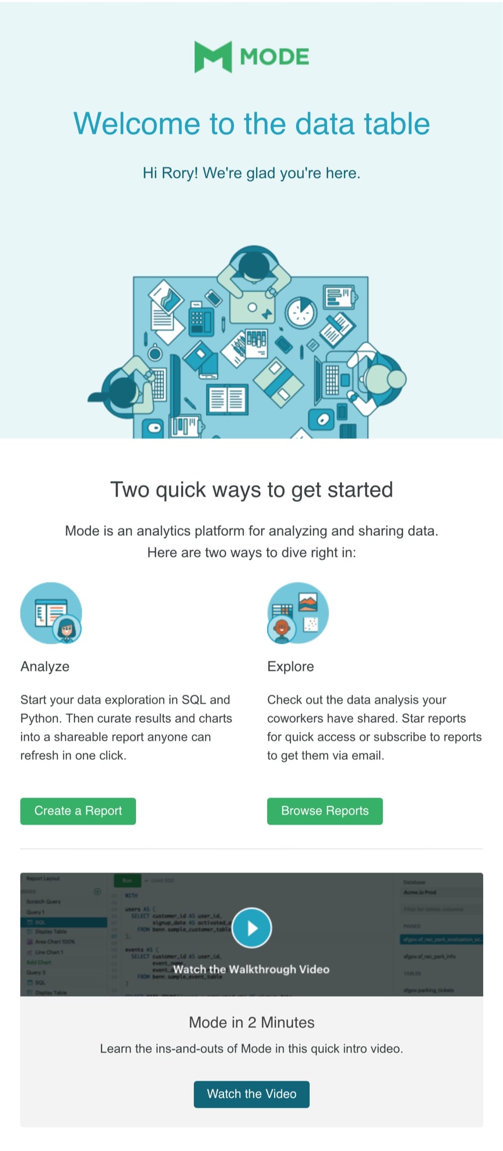
Mode’s welcome email starts with a clean hero image, presenting coders around a desk, with a personalized greeting on top.
Next, you’re given two practical ways to get started with Mode along with an explanation of the analytics platform and a 2-minute video walkthrough.
Even though you can find three different CTAs, they are all strategically selected to showcase the product’s core value.
This welcome email message is super clear and focused.
Subject line: Fantastic. You are in!
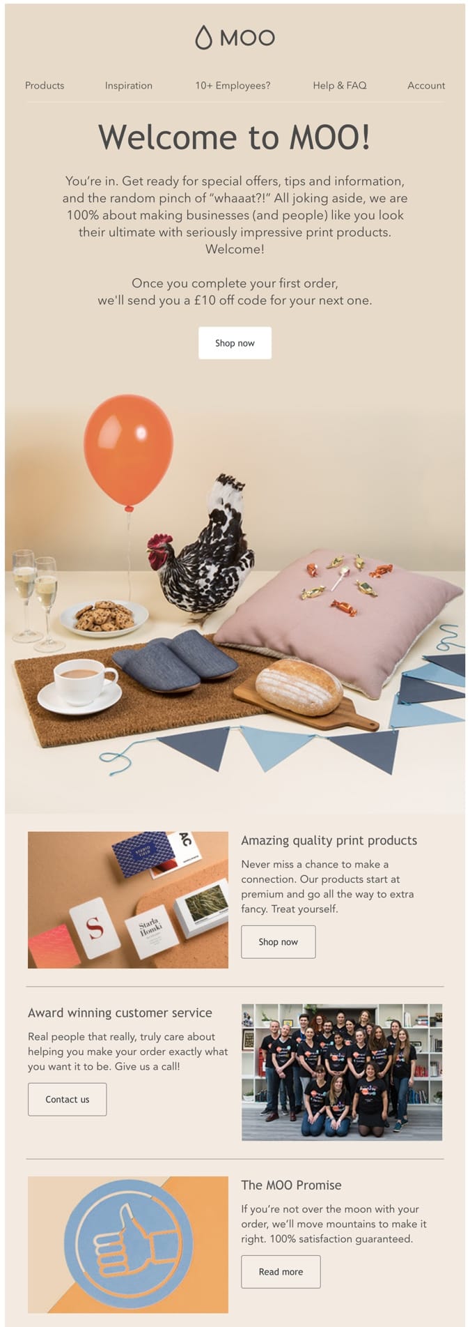
A creative welcome email design by Moo grabs your attention with a fun picture and a fresh color combination: green, blue and yellow.
MOO makes great designs and print for customers worldwide, reinforced with this beautiful, creative welcome email.
After the greeting, they grab your attention with their significant promise, a funny picture (probably presenting some of their prints) and a fresh color combination.
Moo swears that if you use their print products, you’ll impress everyone, and“if you’re not over the moon, they’ll move mountains to make it right.”
Well-said! And it sounds like a strong warranty to me.
‘Award-winning customer service’ sweetens up the deal – when you treat yourself to Moo’s products, you’ll be served by over-achievers and trust you’ll receive an experience above expectations.
Subject line: Get Started With Pipedrive

Pipedrive uses several welcome email best-practices to engage readers and encourage them to take the next step in the journey. They bet on social proof, and they have good reasons to do it because it reduces anxiety and quickly builds trust.
But, Pipedrive doesn’t stop there. They take persuasion to another level by using their ratings [#1 CRM Software] to show off the excellent quality of their product and quickly establish trust and credibility.
Next, they share an explainer video that shows everything you need to know about the product.
According to Wistia, videos up to 2 minutes long get tons of engagement. After that, the drop-off in engagement is significant, so it’s worth ensuring your videos are short and packed with value to keep your viewers engaged.
This will ensure the majority of viewers also reach your CTA at the end of the video.
Pipedrive finishes up the welcome email with quick links to helpful resources and stats that will ensure it’s the right tool for you.
Well done! 🙂
Pro tip: Check this 4-Step Formula for More Persuasive Emails.
Subject line: You’re in. Welcome to Starbucks Rewards
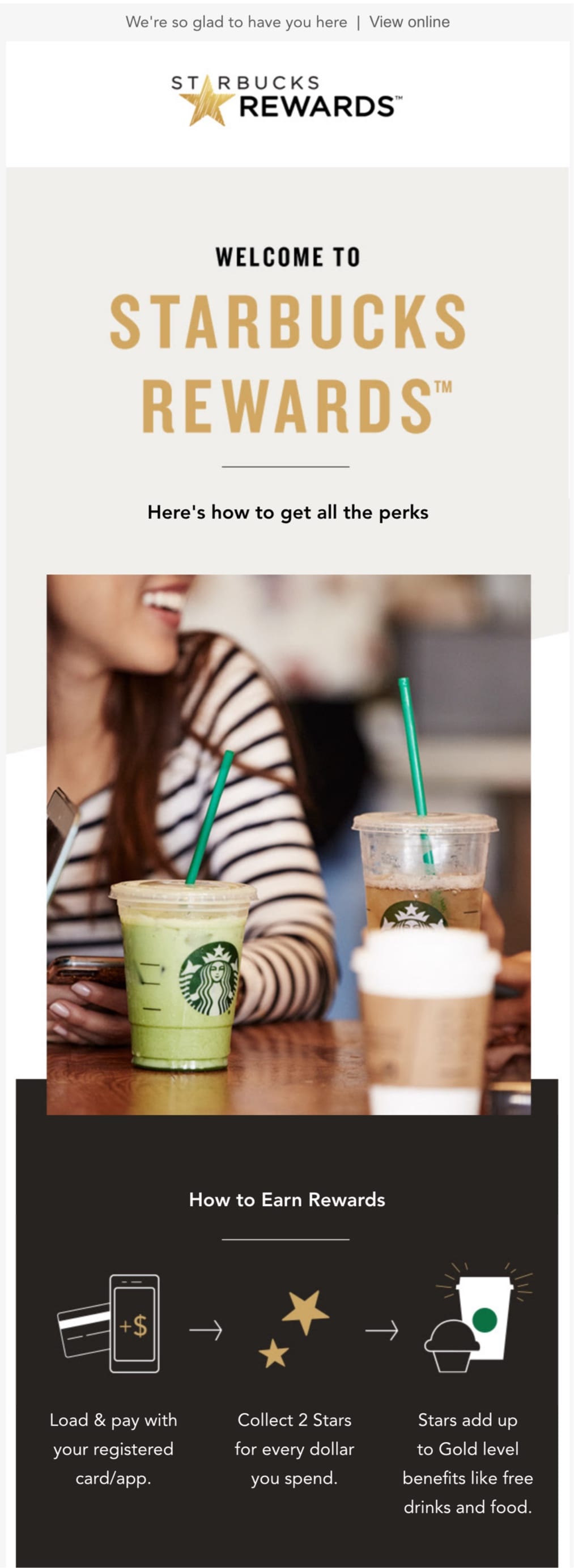
Starbucks is well-known for its creative marketing communication. So when I review the best welcome email examples, it’s my job to cover Starbucks.
And Starbucks nailed it, as expected. This welcome email is (almost) perfect:
It quickly jumps into the perks you’ll get from the Starbucks Reward program.
It includes clear and focused copy that’s interlaced with beautiful visuals and illustrations.
All the elements suit each other for a smooth welcome email.
But wait, there’s one thing missing! There are no clear CTAs. Although this welcome email example is informative, CTAs could be added to each section. After all, your emails should always be targeted towards a specific action.
Pro tip: Think strategically about the call to action in your welcome email. Also, when your email gets lengthy, don’t hesitate to sprinkle several CTAs at strategic locations. The best option is to tie one CTA to each section.
Subject line: Welcome to TripIt, Kasia
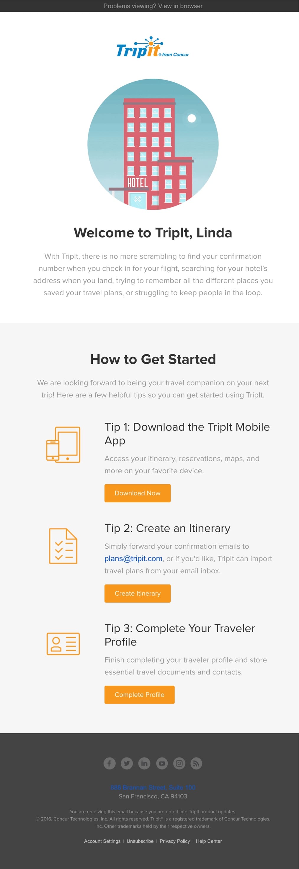
TripIt’s welcome email takes on a similar approach that’s used by Asana. They use the 1-2-3 formula that makes it easy for the reader to process and take action. Simple and actionable.
Subject line: Welcome to Turo
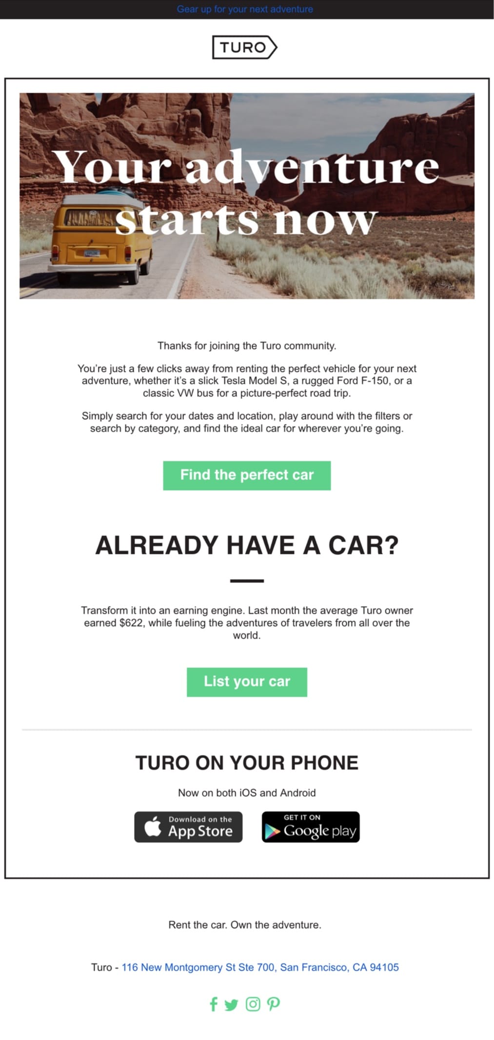
Turo’s welcome email starts with a visual of a van on the road in the middle of nowhere, probably somewhere in Utah or Arizona. It brings to my mind the idea of #vanlife, which is in fashion recently.
A hero image along with the introductory statement
“Your adventure starts here”
encourages you to hit the road. And your imagination takes you there.
ALMOST. All you have to do to get there is to click to find your perfect car.
Turo’s visuals and content flow smoothly together and compliment each other. It’s natural.
Although this welcome email is brief, all the elements are in place. Turo’s marketers are great storytellers!
Pro tip: Keep your message concise, but make sure to press the right buttons and inspire the user’s imagination.
UGmonk
Subject line: Welcome to Ugmonk!
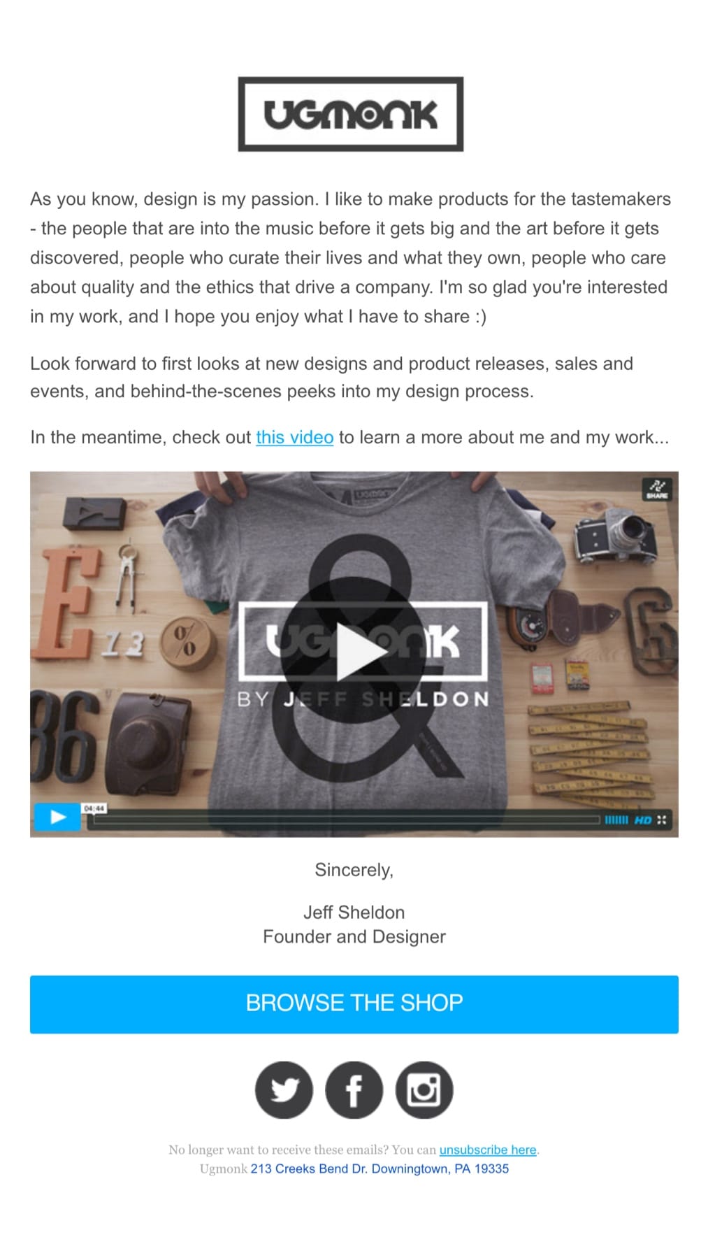
The first thing to catch my attention in Ugmonk’s welcome email is its form.
UGmonk welcomes you with a short note from the founder, Jeff Sheldon, and an interview-style video that feels personal.
This story introduces you to the everyday life of a committed designer who came up with the idea and then had his idea to become something else.
Jeff shares an inspiring narrative that dives deep into the details, values, and reasons for starting a design brand.
A key thing here is that you can relate to Jeff and the story behind the brand, so it builds a connection and likeness for the user.
Fueled with a passion for design and creativity, this welcome email will surely win the hearts of creators, artistic souls, and tastemakers with its authentic feel.
Pro tip: Don’t be afraid to reveal the heart and soul of your brand: that’s what will ultimately get people’s attention.
Unsplash
Subject line: Welcome to Unsplash

Unsplash’s welcome email begins with a short story about the brand, explaining how it began and how the app works. Storytelling can make your brand more authentic and relatable, so don’t shy away from using real-life narratives.
The opening statement captures all the necessary details to gain your trust and inspire you to get you started.
The second part encourages you to join the community and gets you thinking about the photos you already have, so you can start sharing right away.
Unsplash uses clear value propositions and wraps their welcome email content around it. It’s a great practice that helps you keep your messaging tight and craft actionable CTAs.
How to write a great welcome email
We’ve reviewed hundreds of welcome emails from different industries to provide you with this welcome email collection. With such extensive research behind you, it’s easy to identify what it takes to craft the perfect welcome email.
Let’s summarize some of the best welcome email practices
Personalize your welcome email to deliver content your users will value. Track customer properties and event data to add dynamic content to your emails and push notifications.
Create an automated workflow to easily visualize and design your welcome email and the following steps in your customer journey. This way you can monitor the performance of your campaign and quickly identify opportunities for improvement.
Ensure your welcome email is displayed in the local language of your reader to increase engagement rates. The easiest way to do so is by using Vero’s multi-language campaigns.
Play with language and keep it fresh when writing content for your emails. Introduce your personality and ensure it’s consistent with your brand tone-of-voice. Stick to the point and always refer to one thing at a time.
Think strategically about the call to action in your welcome emails. Consider your overall objective. What action do you want people to take? If your email gets lengthy don’t hesitate to sprinkle additional CTAs at strategic locations.
Use clear value propositions and wrap your welcome email content around them.
Keep your message concise. Make sure to press the right buttons and inspire your user’s imagination.
Optimize your emails for short attention spans. Use headings, subheadings, bullets, and other tactics to communicate quickly.
Make your welcome email simple, clean and visual. Create an authentic and memorable brand identity.
Use the 1-2-3 formula to make each step clear for the subscriber. Be helpful and make it easy to get started.
Storytelling makes your brand more authentic and relatable, so don’t shy away from using some real facts.
Introduce your team with real photos to make your brand more human, friendly
An excellent subject helps you boost your open rates and reach even more people, so make it compelling.
The post 21 Best Welcome Email Examples to Engage Customers appeared first on Vero.
Read more: getvero.com

