I’m always inspired by the creativity that goes into YouTube banners, but if you’re anything like me, you’ve probably wondered how you can create one for your own channel. Well, you’re in luck!I’m here to uncover some of the best-kept secrets about YouTube banners.
In this article, you’ll learn what makes the best YouTube banners so eye-catching, and how you can create your own gorgeous channel art. To answer those questions, I’ve included some excellent resources for YouTube banner templates (spoiler alert: they’re free), as well as 10 creative channel banners that inspire us as content creators.
What makes a good YouTube banner?
A good YouTube banner is eye-catching, readable, and conveys the brand of the YouTube channel. The best YouTube banners include the brand’s logo and channel name. Some great YouTube banners include high-quality photos and graphics to create visual interest.
No matter how good your YouTube banner looks, the last thing you want is for yours to look the same as someone else’s. That’s why the guidelines I mentioned for great channel art are pretty simple. You can build the foundation of your design using those best practices, but your unique creativity is what will set your banner apart from the crowd.
To see these tips in action, let’s look at some fun and creative YouTube channel art examples.
YouTube Channel Art Examples
1. Jillian Harris

Simple, chic, and feminine. Jillian Harris’ YouTube channel art conveys exactly what her brand represents. The banner photo keeps things simple and includes only two pieces of information: her name and the date she established her brand. With a banner like this, the typeface stands out and becomes the design.
Simple channel art works if you’ve got a core following already. Jillian is quite popular on other social networks, and she’s currently migrating her audience to YouTube. The majority of people watching her videos are already familiar with who she is and the content she creates. If they’re not, there’s a welcome video right below the banner where she introduces herself to the new crowd.

Shopify understands that building an online business isn’t easy. So, the company offers new and experienced entrepreneurs a library of video content to help them scale to the next level. Learn With Shopify’s banner is straightforward and draws attention to the channel’s goal.
You might think that the YouTube banner dimensions don’t provide enough room to create a dynamic design, but Shopify shows some interesting possibilities in its channel art. The name of the channel is prominent so the viewers know they’re in the right place for all things Shopify, and the green gradient gives this banner depth and creates visual interest.

Maybe I’m a little biased, but our YouTube channel has a pretty cool banner! What we haven’t seen in the first two channel art examples are faces. HubSpot’s banner features full-color images of the creators who present the video content on the channel. Our signature brand art (aka the blobs) are thoughtfully placed behind the creators’ photos so they pop on the banner.
Another fun feature of our channel art is the icon on the far right that points to our free digital marketing certification. If your brand offers more types of content, this is a great way to drive traffic to those other marketing offers.
Alphonso Dunn is a talented and well-respected artist who’s authored several art books. He’s transitioned his passion for educating students to the YouTube screen where he teaches aspiring artists how to hone their craft.
His banner includes samples of his art, his name, logo, and latest books with a link to purchase them. The composition of this banner fits everything in without overcrowding the space which allows the viewer to focus on the rest of his home page.

Justin Brown is the creator of Primal Video on YouTube — a channel dedicated to teaching entrepreneurs how to amplify their businesses with video content. If this is your first time seeing Justin Brown’s YouTube home page, you’ll know exactly what to expect from his content after seeing the banner.
What I like most about this channel art is how energetic it feels without looking too busy. There’s dimension built into the image by stacking the blue and black blocks of color, then breaking that up with a color-graded photo in the middle. Font sizing and colorful backgrounds create a cohesive feel while keeping the design clean and organized.
6. Bright Side
Bright Side provides more than 40 million people with the answers to questions that they never asked, but absolutely have to know. Its YouTube channel art is bright, punchy, and bold — a perfect backdrop for inspirational, creative, and wonderful video content.
If you take inspiration from Bright Side’s banner, choose a vibrant color as your background and think carefully about your typeface. Since those two design elements will be the only aspects of your banner, you’ll want to spend time finding the right balance that represents your brand and draws the viewer in.
7. Epicurious

Whether you’re looking for easy-to-follow recipes, food science education, or cooking comparisons, Epicurious is the channel to watch. The spotlight of this brand’s content is always the food, and that goes for its banner, too. The use of a high-resolution, detailed photo of a common food — broccoli — creates a relevant and intriguing background for the brand name.
To incorporate this banner style into your channel art, choose a subject that’s small enough to be recognized close up.
8. TripAdvisor

TripAdvisor is a resource used by millions of travelers to discover and rate lodgings, restaurants, and much more information about endless destinations.
That’s represented in the YouTube banner by portraying what the site is all about — travel. The banner features beautiful photography of different locations which puts the viewer’s focus solely on travel.
This is a great YouTube banner to take inspiration from if you’re just getting started. Simply choose a high-res photo that speaks to your personality and brand, and you’re done.
9. Refinery29

Showcasing the people that make your brand amazing is a great way to form a connection with your viewers. That’s one thing that Refinery29 does well by frequently featuring its writers, editors, and content producers in its videos. As it turns out, they’ve all become quite popular personalities — which is why the brand put them front-and-center in its channel art.
Creating a banner of this nature is two-fold. First, find a way to incorporate your company’s talent into video content in a way that’s engaging and appealing to your target audience. Then, once you’ve produced enough of that media consistently — and if it’s gaining the right kind of attention — you can use those personalities to promote your channels.
10. The Action Lab

Physicists and high school science students alike come to The Action Lab’s YouTube channel for DIY experiments performed by Dr. James J. Orgill. On this channel, you’ll see everyday objects through a new lens thanks to his demonstrations.
The banner for the Action Lab’s YouTube channel is fitting for this type of content. It includes the logo and channel name in the safe zone, along with a photo of Dr. Orgill himself. Similar to HubSpot’s channel art, his photo stands out with a patterned background to really show him in action.
YouTube Banner Size
A YouTube channel banner will take on different dimensions depending on what platform is being used to view it. For example, a banner will have different dimensions when viewed on a TV, desktop, or mobile device.
The YouTube banner dimensions are:
Recommended “TV”: 2560 x 1440 px
Minimum for upload: 2048 x 1152 px
Minimum “Viewable On All Devices”: 1546 x 423 px
Maximum “Viewable On Desktop”: 2560 x 423 px
File size: 6MB or smaller
The recommended resolution seems pretty large for a single file, but think about how YouTube banners would appear on a 30″ smart TV or higher. With a growing number of options to view YouTube videos in this way, you’ll want to make sure your channel art is large enough to display with quality on larger screens.
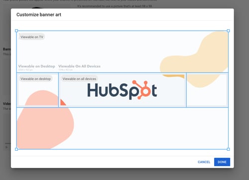
Here’s a helpful visual representation of those dimensions:
Take note of the “Viewable On All Devices” I alluded to in the first section. Your banner is essentially the biggest branding opportunity when people land on your channel. You’ll want to make sure your logo and supporting text is clearly represented in the channel art. That’s why it’s a good idea to place your company name and logo in that center space.
If you’re not sure how to fill the entire frame with visual content, video production company MiniMatters suggests “build[ing] the image from the middle out,” putting the most important assets in the center, and expanding the design from there.
Finally, follow these best practices to create a professional YouTube banner:
Use a high-resolution image. A pixelated or blurry banner doesn’t exactly signal that there’s a high-quality video to follow.
Keep your banner on-brand. While your channel art doesn’t have to be a carbon copy of your logo or tagline, it should incorporate visual elements that you want associated with your brand, like certain colors, fonts, or keywords.
Update your banner regularly. For example, if you run a bakery and you’re gearing up for summer, an eye-catching banner might be a high-res photo of a brightly-colored work surface covered with flour and a rolling pin, along with accompanying text like, “April showers bring May flours,” but remember to update the banner once the season is over so viewers know you’re consistent.
YouTube Banner Template
By now, you might be thinking, “Where the heck am I supposed to get these beautiful design assets?”
Check out these free channel art templates that will speed up your workflow. And they’re completely customizable, so you don’t have to worry about your channel art looking exactly like someone else’s. Download them now and follow the steps below to upload them to your channel.
How To Make a YouTube Banner
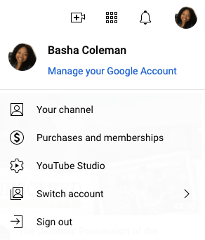
Step 1: Log in to your YouTube account and click on your profile photo. Then select Your channel.
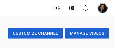
Step 2: Click the blue Customize Channel button. A new tab will open and you’ll see a Channel customization screen.
Step 3: Click Branding in the top menu.
Step 4: Under the banner image section, select Upload.
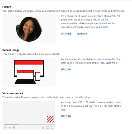
Then, you’ll see the option to upload a file for your YouTube banner photo.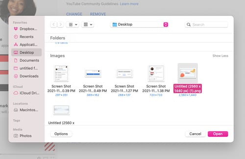
Step 5: Review the image preview to ensure that your banner image is displayed properly.
Step 6: Click Publish and review your YouTube channel’s new banner image.

That’s it! Easy enough right?
Channel Your Creativity
It’s important to note that cool YouTube channel art is just one part of a comprehensive video content strategy. It doesn’t matter how beautiful your banner is if your channel lacks quality video, or hasn’t added anything new in several weeks. So as you create your YouTube banner, go ahead and create two or three more that you can use throughout the year to keep things fresh and interesting.
And remember, you can always come back to these examples and tips for more inspiration.
Editor’s note: This post was originally published in November 2020 and has been updated for comprehensiveness.
![]()
Read more: blog.hubspot.com


