For the past several years, I’ve taken a moment every December to reflect on what I’d learned about Facebook ads that year. I’ve turned those thoughts into blog posts, in hopes that these lessons help guide YOU in the New Year.
This is the FIFTH edition of this post (scroll below to see my thoughts from previous years), and it’s so interesting to scroll through and see how quickly things change over such a short period of time.
I’m grateful that we work in an industry that changes so quickly and keeps us on our toes… how boring would it be otherwise!? 
This year brought new lessons for me as I branched out on my own and started media buying for clients. I’ve learned A LOT.
I tested a ton of stuff. Some of it worked, some of it didn’t. I was fortunate to work in many different markets, promoting an array of products.
I also really paid attention to how Facebook changed over the course of 2018, especially in reaction to the Cambridge Analytica scandal…
Changes on the Facebook Front
The Cambridge Analytica situation changed Facebook. It created a narrative among the general public that Facebook may not be safe, and in order to gain that trust back, Facebook had to make some changes… changes that provided a safer and better experience for Facebook users.
We, marketers, felt these changes pretty strongly.
Facebook is changing every single day in efforts to provide a healthier and more productive experience for users.
There were small changes, like the removal of some targeting options and custom audience size.
But we also saw large changes. Nothing that was publicly “announced” by Facebook, but changes that most of us as advertisers experienced. Certain strategies that used to work in 2017 quit working. Ad costs also rose for a lot of marketers.
This year, I heard, “I just can’t get Facebook to work!” from all of you at least a few times a week—and I get it.
But, what I’ve learned is that it’s not that Facebook isn’t “working.” It’s that Facebook is changing every single day in efforts to provide a healthier and more productive experience for users.
It’s also what I hope every business is doing… constantly improving their product or service for the betterment of their customers.
And as Facebook evolves, we as marketers must too. So, how do we do that? What should we focus on in 2019? Let me explain…
As marketers, we sometimes forget that Facebook is a social media platform. It’s a mirror. It reflects whatever messages we are putting into the platform.
We control what we post AND the posts we see based on what we engage with.
The platform is literally built to give you more of what you want, and this can be used for good or bad.
Facebook wants you to perpetuate GOODNESS on its platform. It’s that simple. They’re a company rich in values.
As advertisers, if we are perpetuating negativity OR not starting a conversation at all, Facebook isn’t going to spread our message (aka show our ads).
Facebook wants you to perpetuate GOODNESS on it’s platform.
Over the last year, we’ve seen a huge shift in Facebook showing more ads that use positive language, positive imagery, and are helpful to the end user, rather than feeding off of their fears, insecurities, or promising unobtainable end results.
But why did things change so quickly? Simply, Facebook didn’t have to enforce their values as strongly until the aftermaths of the 2016 election and the Cambridge Analytica scandal.
In the spring of 2018, Facebook was receiving heat from the government and general public. Because the media positioned the scandal as a “data leak,” Facebook lost trust from some of its users. The public threatened to abandon the platform. The entire company fell under intense scrutiny.
Facebook had to respond and prove to the public that it was taking action to make sure this never happened again.
Luckily, Facebook already had a method for measuring the experience advertisers were providing consumers through their ads.
Way back in 2015, they released the relevance score. A score from 1–10 that indicates how well an ad relates to the interests and needs of the target audience.
It’s unknown exactly how the relevance score is calculated, but I know it consists of click-through rate, post engagement, negative feedback, positive feedback, conversion rate, and more.
The higher the relevance score, the lower the ad costs. This has been proven again and again. Whenever I’m experiencing high ad costs, it almost always correlates to a relevance score lower than 5.
Relevance score was the first indication that Facebook was optimizing their ad platform for social proof and consumer satisfaction.
It makes sense, too.
The more end users (humans with a free Facebook account) enjoy the posts they see on Facebook, the longer they’re going to spend on the platform, and the more revenue Facebook collects in ad dollars.
Social Proof as a Solution
Social proof is what will save you on Facebook in 2019.
This is the most important takeaway from this article.
Social proof is what matters on Facebook in 2019.
It matters more than ever.
In March of this year, I brought on a client that sells Christian products. Over the summer, I watched ad costs rise in every one of my client accounts (mostly e-commerce), except for this client.
Why?
Because they have social support. The message that this company conveys in its ads is not only liked by the market, but it’s also supported, and the market wants to show their support.
Our most engaging ad from this year has 100k shares. The cost per click is only 11 cents. I haven’t seen ad costs like this since 2013.
Each of the last 3 months, I’ve launched a new FB ad campaign for this client. I have 4 ads in each ad set. Two of them are existing ads that have significant social proof (50k+ shares each) and 2 ads are brand new. The 2 existing ads have outperformed the 2 brand-new ads all 3 months!
Social proof is what matters on Facebook in 2019.
So, what does this mean for you??
Your ads need to ignite something in your audience. They should make your audience FEEL something so strongly that they have no choice but to react, comment, or to share your ad.
The days of direct-response ads that list the features and benefits of a product without relating to the audience are over. Facebook doesn’t have to and won’t show boring ads.
Even if you’re selling a product that feels “boring” or that’s hard to create a community around, there is hope. Tell a story. Make people laugh.
I have a client who sells daily planners. At first, I was worried about our ability to generate social proof because it was such a commodity product.
I found some amazing customer stories of how this planner had changed the lives of a few individuals and used their stories and photos as my ad copy and creative. It worked like a charm because other humans on Facebook related to these stories and felt compelled to share theirs in the comments, too.
Tell a story. Make people laugh.
Using motivational ad copy to excite your market generates social proof, too. People respond well to motivation and they’ll want to share the message with their friends.
So when you sit down to write ad copy, think about what this market would respond to. What could you put in front of them that they’d want to share, comment on, or react to? This is the key to Facebook success in 2019.
But there’s more.  Facebook cares about more than just the relevance of your ad. The ad is just the first step.
Following Through on Your Promise
Facebook cares about the ENTIRE consumer experience.
This means everything from clicking on the ad to purchasing and receiving the product.
If someone clicks on a Facebook ad and purchases a t-shirt, but never receives it, that’s a bad look for Facebook, even if they weren’t the one facilitating the purchase.
Facebook cares about the entire customer experience.
They’re putting measures in place to ensure businesses’ aren’t just great advertisers, but that they can also deliver.
This is why Facebook’s starting to take into account the reviews on fan pages into the success of that brand’s ad campaigns.
They’re also starting to ask consumers to rate their shopping experience with brands post-purchase, and using that information to judge the reach and costs of ad campaigns.
It’s obvious that Facebook cares about the entire customer experience. So make sure you’re providing that in 2019 and you’ll be just fine.
It’s important to think about the experience you’re providing AFTER someone clicks on your ad, too. This is important to Facebook. It’s essential to look at things like page-load speed, and the mobile experience you’re providing.
It’s why Facebook Messenger will become even more essential in 2019. Users already understand how to navigate the platform and Facebook likes that you’re keeping people in their ecosystem.
(RELATED: Facebook Messenger Ads: How to Use Them in Your Business)
It’s also why Instant Experiences will be huge in 2019. Formally known as Canvas ads, Instant Experiences are “a mobile ad solution that brings brands and products to life in a full-screen, post-click experience that loads almost instantly from ads in Facebook and Instagram feeds.”
Basically, you can build a simple landing page that summarizes your offer. Consumers don’t have to digest your entire website to make a purchasing decision.
The name of the game is social proof and user experience. And most important of all, remember that humans are on the other side of the keyboard, and you will succeed.
Hopefully, this look back over the last year helps you, and you aren’t worried about the rising ad costs and “difficulty” of Facebook advertising as we go into 2019.
And if you want to read about what I have learned in previous years of working with Facebook ads, just keep reading! It can be really helpful to see the big picture of how paid traffic has changed over the years.
(NOTE: Want the Ultimate Facebook Ad Template Library? Copy and paste these 7 proven Facebook ad campaigns to create low-cost, high-converting ads on demand. Get them here.)
4 Lessons Learned from Running 1,573 Facebook Ad Campaigns in 4 Years
Here are 4 lessons I learned in 2017 (that I wish I had known long before).
1. Understand That Scaling Paid Traffic Campaigns Involves More Than Just Increasing Your Budget
When most people think about scaling a paid traffic campaign, they imagine increasing the budget and, in return, proportionally receiving the same results.
For example, imagine you were spending $100 a day on a campaign and generating 50 leads for $2 a lead. Most people would expect to increase the budget to $200 a day and in return receive 100 leads for $2 a lead.
Unfortunately, most of the time, that’s not how media buying works. Especially on Facebook.
By increasing the budget, you are asking the platform to show your ad to more people.
Platforms like Facebook and Google have algorithms that factor in…
Your budget
Your targeting
Your desired end result
…and much more.
All to help you get the best results possible (and to create the best experience for the end user).
(RELATED: The Ad Grid: How to Build Traffic Campaigns that Convert Higher and Scale Faster)
Just because you feed the machine more money does not mean that they can guarantee more of the same results.
Especially if you’re targeting a smaller audience.
There may not be many more “qualified” people left for Facebook to show the ad to. People who are most likely to take the action you desire.
Remember that we are advertising to humans, not robots, and that your target audience can be easily and quickly saturated.
Just because you’re willing to invest more money does not mean that there are more people in the audience you’re targeting that are wanting to take your desired action based off of the messaging and selling system you’re using.
Facebook and Google are not money machines that you can predictably put a dollar into get a dollar back at ANY scale of budget.
I call increasing your ad budget vertical scaling.
It’s usually the only type of “scaling” that media buyers use… but I feel it’s the least predictable.
Of course, I still increase the budget of campaigns that are working, but I also scale media by horizontal scaling, which involves showing your ad(s) to more people in your market in different ways. Such as:
Testing new ad copy variations or “hooks”
Introducing new offers and selling systems
Scaling out to other people in your target market via new targeting
If you think of your target market like a pond of fish…
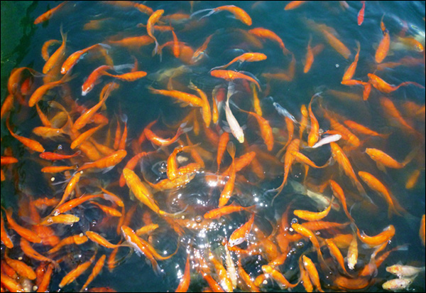
…and you’re only using one hook, one selling system, and one way of targeting, then you’re only resonating with a small, small part of your market… like this:
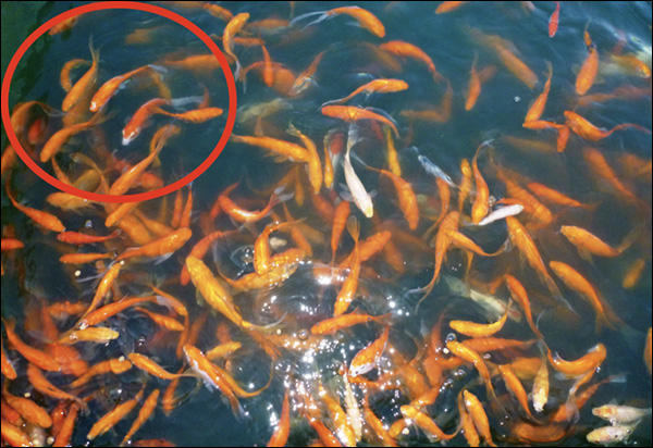
You can scale “horizontally” and achieve greater volume of results by…
Testing New Hooks For Your Ad Copy: Maybe the ad that’s working for you addresses a pain point your market is experiencing. Try new copy variations that speak to feelings, status, or tell a story. These variations will attract different TYPES of people in your market.
Creating New Funnels And Entry Point Offers: At DigitalMarketer, we have different Lead Magnets, from the Facebook Ad Templates to Blog Post Templates. These different offers allow me to scale my customer acquisition efforts because they cover different topics that will resonate with certain parts of our audience. They’re also different “styles” of funnels. For example, a Lead Magnet PDF download versus a video course—these appeal to different types of people based off of how they like to learn. New funnels give you more ammunition for traffic, so you can “gobble up” as much of the market as possible.
Finding New Targeting Options: Whenever I find an audience that’s working, I always try to find more audiences that are most like that one for scale. This could include creating lookalike audiences on Facebook or finding more interests similar to the ones that are working. Scaling horizontally means showing your ad to new people who you aren’t already targeting.
Just to recap, there’s nothing wrong with vertical scaling and increasing your budget to get more results.
But this shouldn’t be the only scaling you do. Focus on horizontal scaling to really see a huge growth in your business next year.
2. Change the Way You Describe and Research Your Target Marke
When asked, most marketers or business owners would describe their audience as….
Women who live in Manhattan
Teens between 16–18
Young professionals making $40,000–$49,999 annually
…and so on.
As humans, we are taught to describe people by generic demographic information… age, gender, income, etc.
As marketers, we have access to WAY too much data to be that generic in 2018.
Instead, describe your avatar based on their INTERESTS and INTENT.
For example…
Interested in canning peaches
Read Rich Dad, Poor Dad
Needs a new car
Wants straight teeth
Attended SXSW
Is the Director of Marketing at a tech company
Fan of David Bowie
Really get into the mind of your avatar. What do they read? What do they buy? Who is this person… way beyond any generic demographic information?
This will allow you to be very specific in your targeting…
To target people who are AVID in your market via what they’re interested in on Facebook.
To target people who are searching Google about a specific problem they’re experiencing that you happen to solve.
It’s also important to think of triggering events that may lead someone to the purchase of your product, especially if you’re selling more of a commodity. Triggering events are things like:
Job change
Birth of child
Marriage
Divorce
Major system/utility failure (AC in Summer or CRM for business)
Holidays
Graduation
Aging
Triggering events create windows of opportunity where your prospect is far more likely to act. Triggering events can help you decide on your targeting within an ad platform.
Let’s say, for example, we were selling suits…
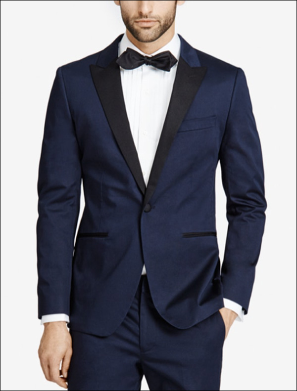
What are triggering events that could lead someone to buy a suit?
Graduation
Entering the workforce
Young professionals who need a new wardrobe
20–30 somethings who are in “wedding” seasons
Promotion to a new job that requires more business travel
The most important part of targeting your audience on a platform is to really understand them as a person.
Research your market…
Go to events they attend
Read online forums where they’re having conversations
Read Amazon reviews of products in your market
Get into the mind of your consumer and you will never have trouble with targeting again.
3. Put More Thought into Your Creatives
I believe that now, and especially as we go into 2018, the look and feel of the images or videos you use in your advertising are more important than ever.
Your ad creative should act in 2 ways…
As a visual representation of your hook, whatever message you’re wanting to portray to the end user
A trust-building mechanism with your brand
Consumers expect things on the internet to look high end in 2018.
Invest in graphics and videos that look as good as you know your brand and product are. But, also make sure you’re putting thought into your creatives and that you aren’t using irrelevant images like cats or women to catch someone’s attention.
The goal of your ad is more than to catch someone’s attention. It’s to catch the right person’s attention, portray a message to them, and then, if it’s relevant to the end user, they will take action.
Here are great examples of ads who’s creative really reflect the message:
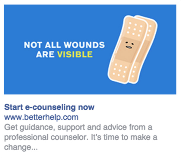
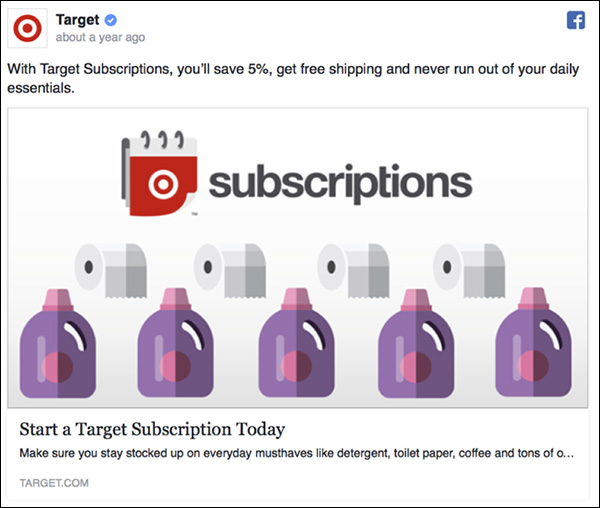
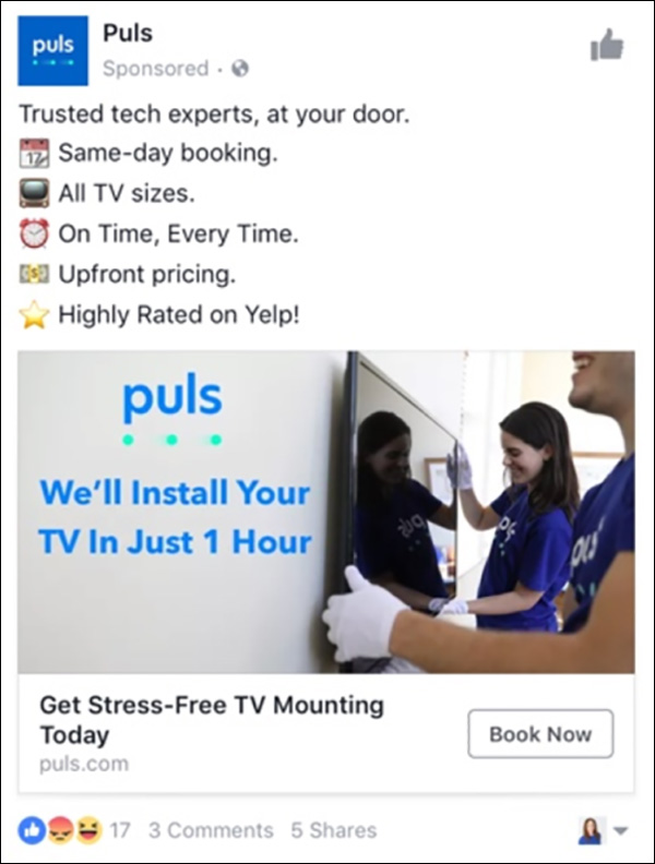
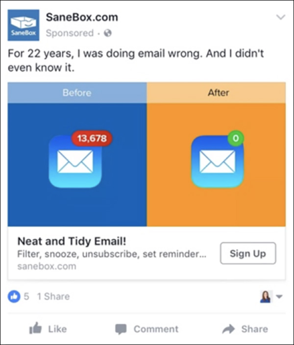
What message are you trying to get across in your ad? How can you create a visual representation of that message?
It’s more important than ever!
4. Realize That Nothing Ever Really Changes but the Medium
The biggest lesson I’ve learned over the past 4 years is that nothing really ever changes about marketing except the medium.
Quit chasing shiny objects!
Study and practice to become a darn good marketer. You will transcend the passing of time.
I love this quote from Roy H. Williams on this subject…
“Five minutes in an old book quickly reveals that most of what is being sold today as new insights into human behavior is merely the rediscovery of knowledge we have had for centuries.”
We are standing on the shoulders of giants who have been marketing to humans for hundreds of years… we just have new technology and mediums to deliver our marketing through.
On the same hand, you must keep up with the new mediums.
What will be the “next big traffic source?”
Wherever the most people are aggregated. If a platform has a ton of users and has a way to collect data on said users, it becomes a gold mine for marketers.
That’s why Facebook messenger marketing is the future of advertising.
(RELATED: Facebook Messenger Ads: How to Use Them in Your Business)
With over 2+ billion active monthly users and a ton of data from the Facebook platform, Messenger will become an even more important traffic and acquisition source for brands.
But, never forget, we are always selling to humans.
Craft an appealing offer, articulate the benefits (in different ways, to appeal to different types of humans), put those messages in front of the right people, and you will win in 2018!
(NOTE: Want the Ultimate Facebook Ad Template Library? Copy and paste these 7 proven Facebook ad campaigns to create low-cost, high-converting ads on demand. Get them here.)
Don’t stop there!
Read Our 7 Lessons Learned from Running 440 Facebook Ad Campaigns in 2016
1. Link Ad to Lead Magnet #1
As you can see from last year’s list of best-performing campaigns (specifically #8 & #9 below), campaigns to Lead Magnets work really, really well for us.
They’re the bread and butter of our business. They’re the way we build our email list. They’re the way we acquire customers.
Website conversion campaigns that optimize for lead generation accounted for 50% of our media spend in 2016.
We’ve found that in one year’s time, we really only need two great Lead Magnet campaigns to grow the business at a rapid rate.
In May of this year, we spent a ton of time creating brand new campaigns for our Facebook Ad Template Lead Magnet using the Ad Grid strategy.
After running a ton of tests, this was the winner.
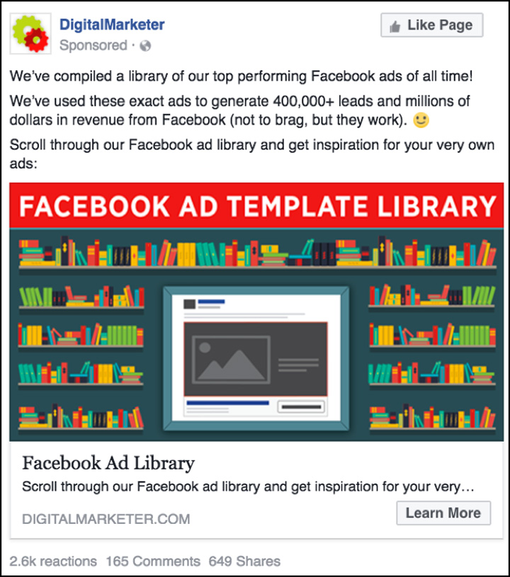
This ad works for many reasons. As we teach in the Ad Grid, the image really portrays the marketing message.
Not only does the image stand out in the newsfeed, it’s also RELEVANT. We’re really playing off of the word “library” and the design elements help the prospect conceptualize the meaning of the ad quickly.
The copy makes the resource feel like something you can’t pass up. Anyone interested in traffic loves swipe files and seeing what’s worked for others (that’s why you’re reading this post), so that’s why we lead with the line about compiling our highest performing ads.
By saying that these ads have generated 400,000 leads and millions in revenue, we’re really layering on the proof and authority.
The call-to-action (CTA) is subtle yet enticing. Instead of telling prospects to “click here,” we’re using language that helps them visualize themselves actually using the resource by encouraging them to “scroll through” the library and “get inspiration for your very own ads.”
This campaign alone produced 83,285 leads at $3.26 a piece.
2. Link ad to Lead Magnet #2
As I said above, website conversion campaigns that optimize for lead generation accounted for 50% of our media spend in 2016.
Our second best lead generation campaign promoted our Customer Avatar Worksheet using the Ad Grid strategy.
After running a ton of tests, this was the winner.
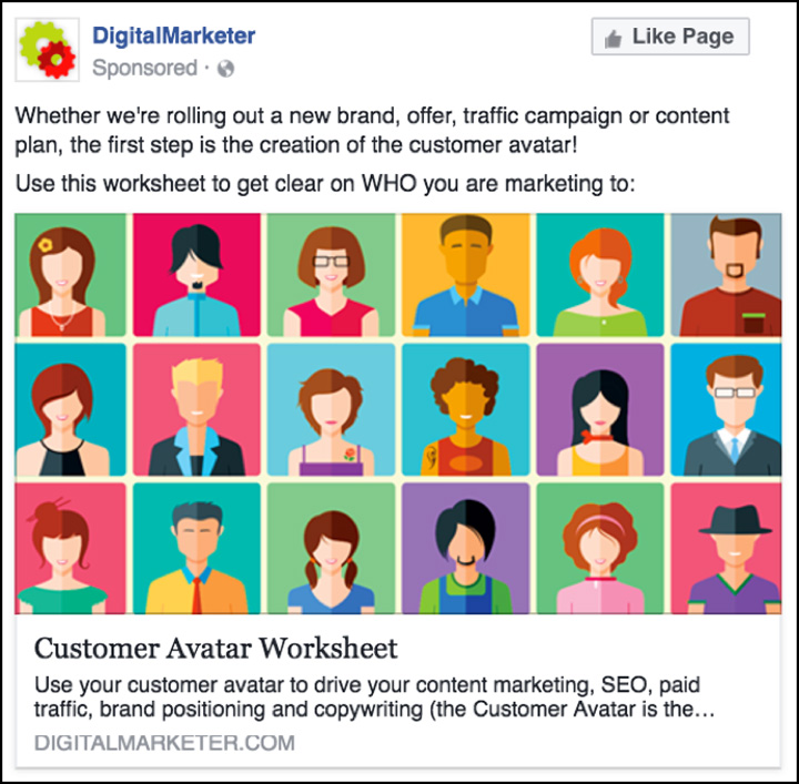
This ad resembles the iconic Brady Bunch image. Anytime you can replicate something that’s worked in pop culture (without violating copyright) absolutely do so. No need to start from scratch.
(We also tried a version of the Guess Who? game but it didn’t convert as well):
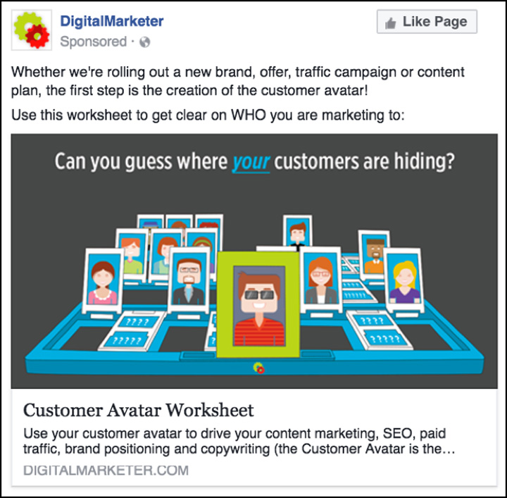
The Brady Bunch-like campaign worked for a multitude of reasons. First off, the ad image is very eye catching and again portrays the marketing message. We used different people in the image to play on the word “customer.”
The first line of copy is educational—which is working better and better now that Facebook’s relevance score is so important to the platform. This line of copy also highlights the importance of defining your customer avatar, which makes downloading this Lead Magnet feel even more essential.
Like the last ad, the CTA is subtle (not using “click here”) yet powerful for the user. They imagine themselves actually using the worksheet to gain clarity on who they’re marketing to.
This campaign alone produced 33,062 leads in the last 3 months.
3. Lead Ad for Sales Team
In 2016, we had a lot of success with lead ads.
In 2015 (right after lead ads were released), I wrote a blog post about lead ads and how they weren’t performing as well as website conversion campaigns. 
I did note that lead ads would be effective if used in certain situations.
The issue with lead ads is that once a user submits their information, they’re not forced to visit your site. So, if you’re running a traditional acquisition funnel, you would have trouble generating those immediate sales needed to offset traffic costs.
But, if you’re in a situation where you JUST need someone’s contact information—lead ads are awesome.
In 2016, we built our very first sales team here at DigitalMarketer. This meant that we needed to alter our traffic strategy a bit.
Instead of needing to make all of our sales online, a chunk of our sales started happening via 1v1 conversations on the phone, email, Facebook Messenger, etc.
Lead ads allowed us to generate high-quality leads for our sales team.
This particular campaign is called “The Modern Marketing Growth Plan.” Prospects see this ad in their newsfeed:
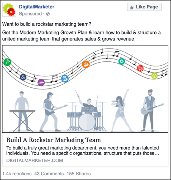
Upon clicking, the form appears (pre-populated!):
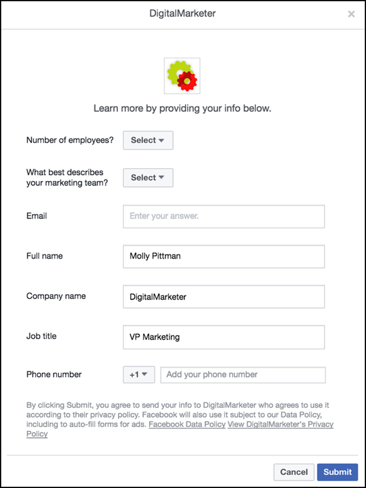
As soon as someone submits their information, the sales team is notified and this person is contacted. If they’re qualified (have a big enough team) the prospect is asked to schedule a time for a consultative call to help structure their marketing team.
If they aren’t qualified, they are sent to a web page to download the plan and then have the opportunity to purchase HQ online.
Lead ads have been very effective for driving leads to our sales team. If you have a need to acquire contact information with no expectation of purchase on the following page, definitely give these a shot.
4. Link Ad to 6-Week Class
One of our best campaigns of 2016 involved getting people to sign up for our free, 6-week class called Double Your Sales.
We ran traffic to this offer in 2015 with a lot of success. But, in 2016, we made a simple tweak to the copy that decreased our lead cost by 30%.
Here’s the ad we ran in 2015:
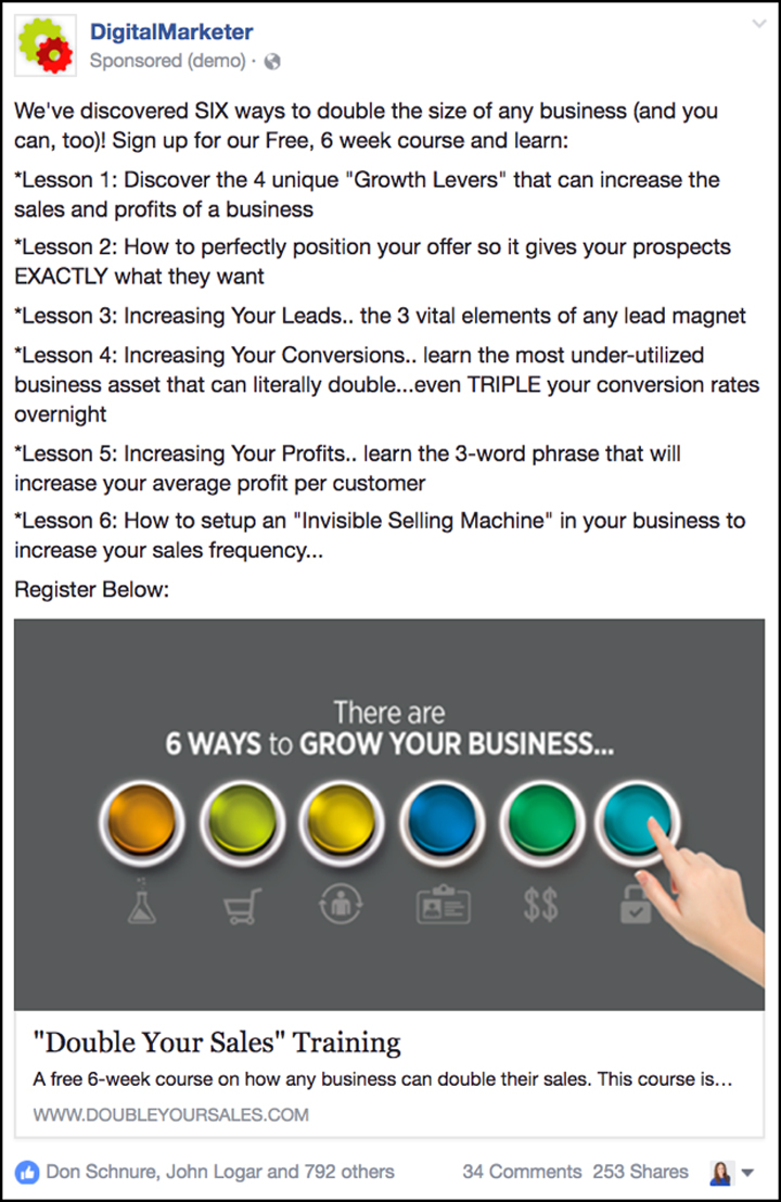
And here’s the ad we ran in 2016:
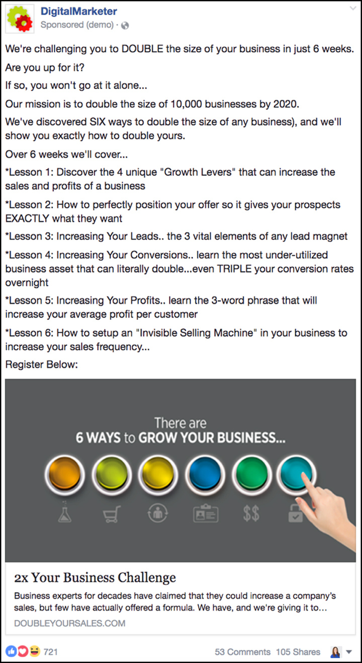
The ads are almost identical with only a few tweaks to the copy.
Can you see what is different?
The second ad (the high performer) spoke directly to the prospect. It CHALLENGED them to double their business in 6 weeks… it even asked them if they were UP for it!
The first ad was all about US! It’s okay to use “we” or “I” in ads, especially when establishing credibility, but if you can find a way to make your ads about the prospect, and especially if you can find a way to challenge or get them excited, you will see higher conversion rates.
If you want to learn how we structured this campaign, read this post.
We were able to decrease lead cost in this campaign by 30% in 2016 vs. 2015.
5. Retargeting (Scarcity) Ads for an Event
So, this was a pretty fun campaign to create and execute.
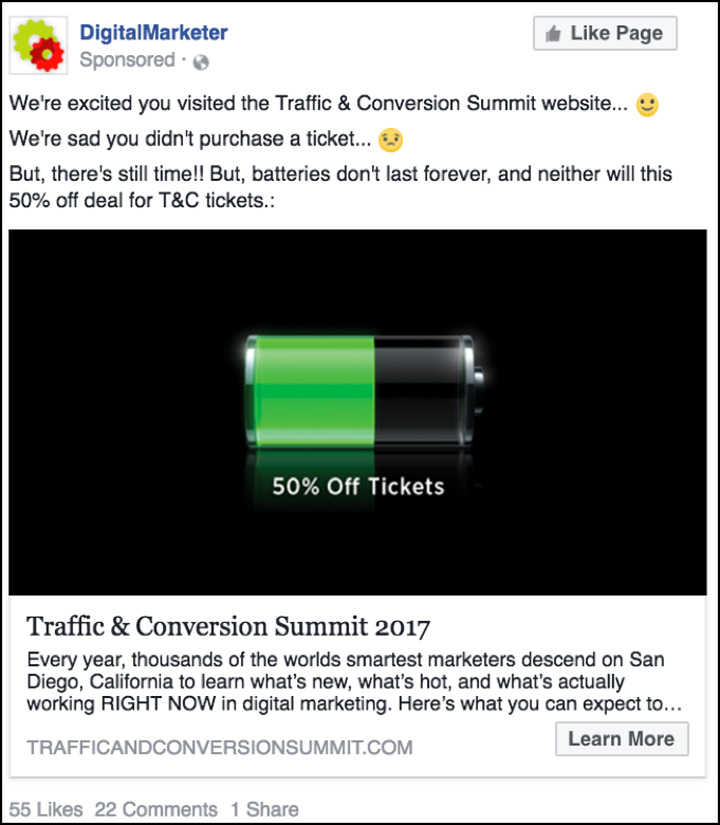
The purpose of this campaign was to retarget people who had visited the Traffic & Conversion Summit website but who hadn’t purchased a ticket.
There are a few price points for the event and the price increases as time passes.
About 3 weeks before the price was increased from $995 to $1495 we started running this ad:
A week before the price increased we switched to this ad and ramped up the budget:
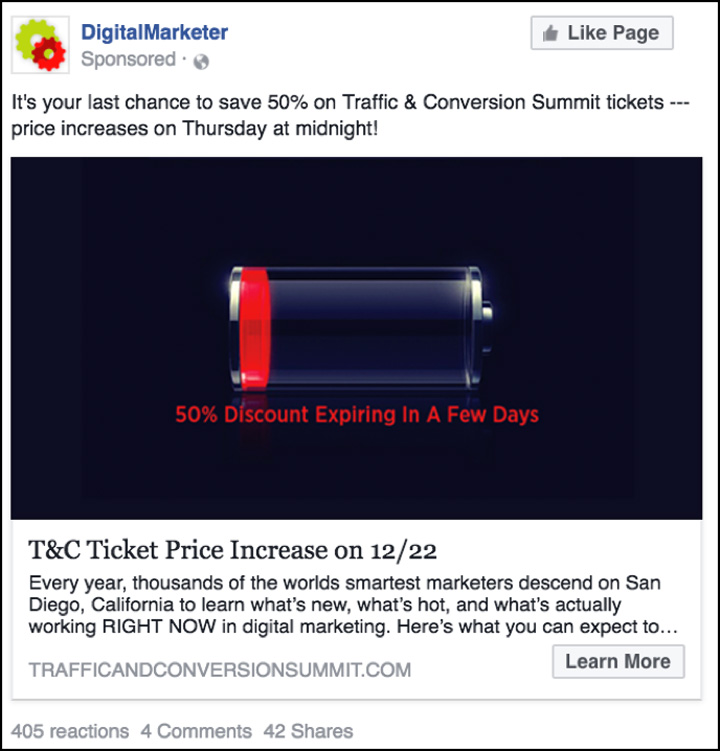
This worked really, really, really well!!
I believe there are a few reasons for this.
First off, scarcity is always your friend as a marketer. Psychologically, people will buy things because they realize in the future they may no longer be available.
With a live event, you have real scarcity. There are only so many seats to sell and the price will increase by $500 on a certain date. If you don’t buy before that date, you will pay more later. Plain and simple.
 I also believe this worked because it plays off of “fear” that everyone with an iPhone already has. Especially if you have an emotional attachment to technology, the red battery icon on your phone can literally initiate fearful emotions.
Now, I’m not saying we were trying to ruin anyone’s day—but, again aligning your hook/image with something that people are familiar with in a culture works well. They already know what the image means. You don’t have to explain it.
If you want to learn more about using paid traffic to sell tickets to events, read this post.
This campaign had a 240% ROI.
6. Facebook Messenger Campaign
Facebook released Messenger ads in 2016. In short, we’re really excited about this.
“Messenger” is now a destination for Facebook ads. So, instead of sending traffic to your website, you can tell Facebook that you actually want your ad to open in a Facebook message.
This allows you to have 1v1 conversations with prospects and customers.
Then, once someone has messaged your page, Facebook and other tools (like ManyChat.com) allow you to send broadcast messages to the list of people who have messaged your page.
We are seeing open rates as high as 90% for those broadcasts. It’s nuts.
The goal of our first Facebook messenger campaign was to generate conversations for our sales team (with the hope that the conversations would lead to sales).
We targeted our email subscribers and asked if they had questions about our product and how we could help them:
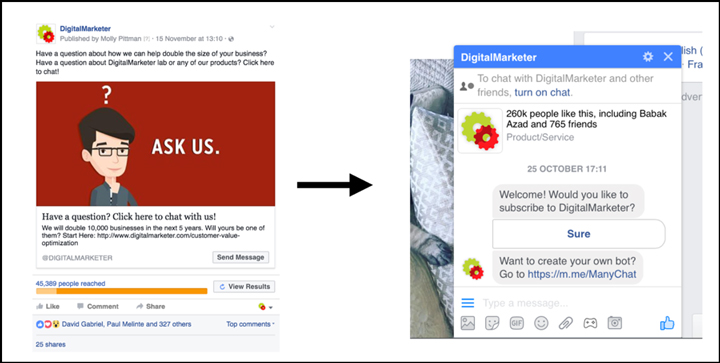
2 members of our sales team were there to field questions and help people decide which DigitalMarketer product would be best for their business.
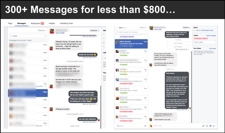
We were able to generate 300 conversations for only $800. We saw a 500% ROI on our first messenger campaign.
This worked well because the questions posed in the ad were relevant to the audience.
Since these people are on our email list, they know who we are. They probably even know what we sell. Asking if they had questions about how we could double their business or if they had questions about our products just makes sense.
If we ran this same ad to cold traffic it may not have done so well.
Why? 
If you’ve never heard of DigitalMarketer, you wouldn’t know what products we sell, or it’s possible that you don’t own or have the immediate need of doubling a business.
The key to Messenger moving forward is to use it to pull levers that will make the biggest difference in your business, especially if you don’t have a lot of human capital to actually man the chat.
Retarget people who visited an order for but didn’t buy. Retarget your best people to see if you can move them further down your Customer Journey. Use this opportunity to try and overcome any barriers to the sale.
This is a HUGE win for 2016, and we’re currently running a ton of Messenger tests that we will share with you guys later.
7. Blog Post to Cold Traffic
Last, but not least, I wanted to share our best Facebook campaign to cold traffic. The purpose of this campaign was to get people who had never heard of us before to consume our content.
This allows us to build credibility, pixel visitors (so that we can retarget them later), and to give value first.
This post was one of the top 6 most visited on our blog for 2016…
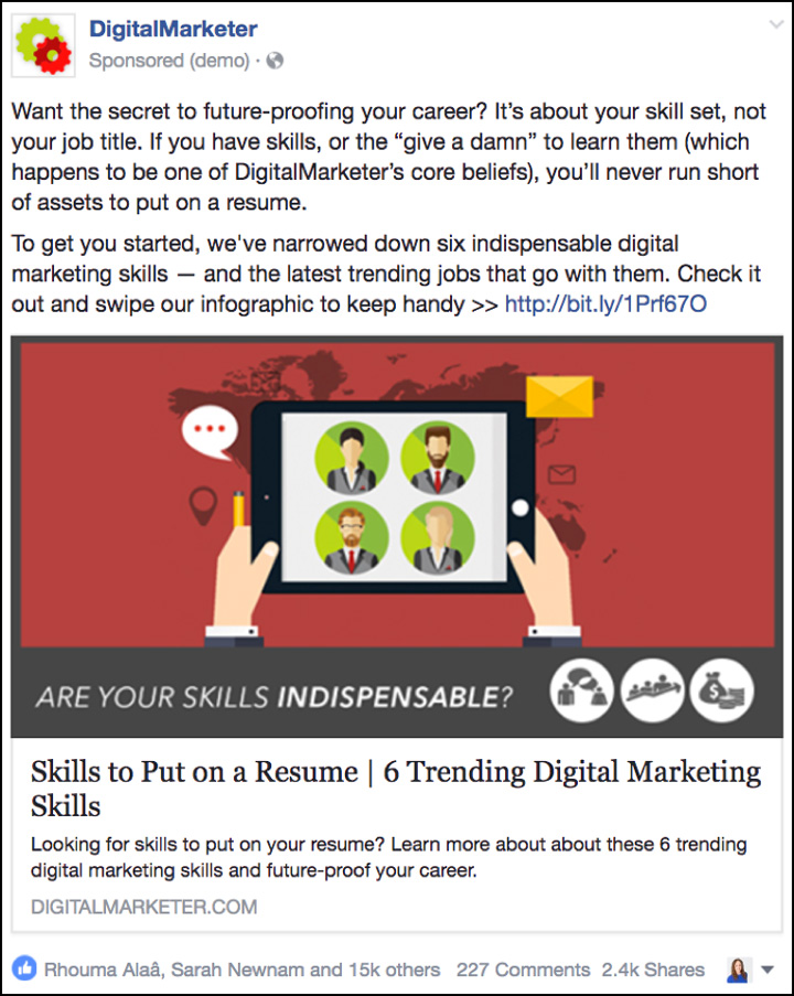
We ran this campaign to digital marketing professionals. People who work or want to work for others in the field of marketing.
One reason this ad worked so well is because of the copy. The opening line really grabs this audience’s attention with, “want the secret to future-proofing your career?”
What professional doesn’t!?
The copy leads the reader to realize how important marketing skills are to the career of your dreams.
(NOTE: Want the Ultimate Facebook Ad Template Library? Copy and paste these 7 proven Facebook ad campaigns to create low-cost, high-converting ads on demand. Get them here.)
But don’t stop there!
Check Out the 7 Lessons We Learned in 2015…
1. Newsfeed Ad to a Lead Magnet #1
Ah, The Ultimate Social Media Swipe File… our highest performing Lead Magnet of all time. It also happens to be the first Lead Magnet we ever ran to cold media here at DigitalMarketer.
You’ll notice that The Ultimate Social Media Swipe File made it onto this list last year (#9 below) which is a testament to having a good offer. Once you create a solid Lead Magnet, it can benefit you for (literally) many years to come.
The Ultimate Social Media Swipe File campaign from 2014 finally tired out.
This was the 2014 version of this ad…
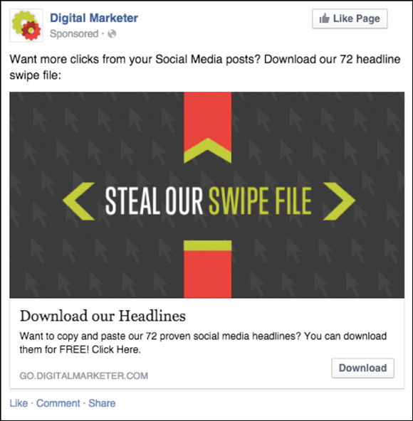
But, we knew this offer still had life.
In July of 2015, we created completely new ad campaigns for the offer.
Here is the highest performing ad from those campaigns…
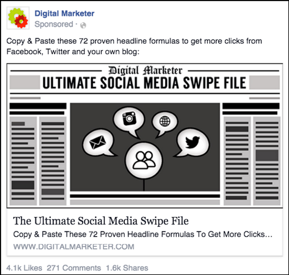
You’ll notice we refreshed the copy and images.
We wanted to scale this offer to an even broader market than before, so we went with the newspaper theme because someone outside of “online marketing” would still understand a “headline” in reference to a newspaper.
We tested these images with color variations and the black and white outperformed all the rest.
The copy works for a few reasons…
We lead with a CTA to “copy and paste.” Using the words copy and paste also express the ease of using these headlines
“72” creates specificity and shows the abundance of headlines they’ll receive
“Get more clicks” speaks to the end result of using the headlines
“Facebook, Twitter, and your own blog” helps to explain the application of the headlines so that the end user doesn’t have to even wonder WHERE they would use these headlines
In 2014, The Ultimate Social Swipe Campaign produced 33,000+ leads for the business. At that time, it was our highest performing advertising campaign to date.
In 2015, our new ad campaigns for this offer (went live July 21st, 2015) has generated 72,033 leads in 2015 alone. (That’s more than double last year)!
2. Newsfeed Ad to Lead Magnet #2
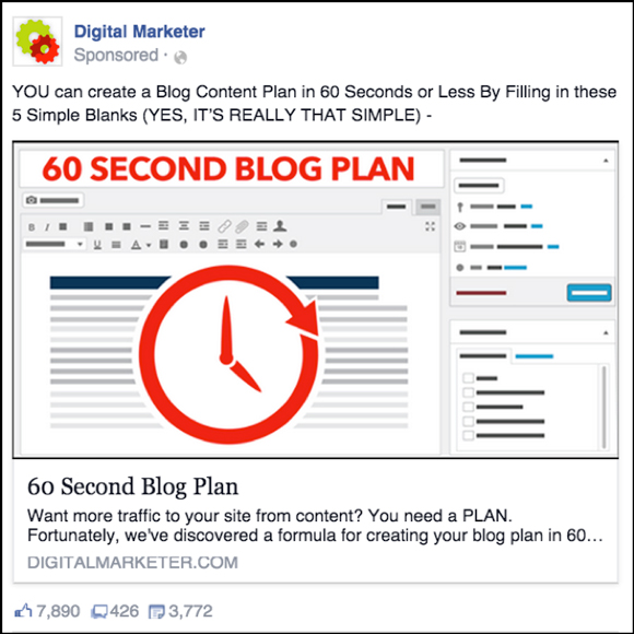
The second ad on our list for 2015 is for our 60 Second Blog Plan Lead Magnet.
This Lead Magnet appeals to bloggers and content marketers.
Notice the ENGAGEMENT on this ad! When you have high positive engagement on an ad (likes, shares, comments) it helps increase your Facebook relevance score. When your relevance score is high, you pay less and your ad is more likely to be shown to your target audience.
Why was this ad successful?
We really, really thought about our target market here.
The ad image looks like the WordPress admin panel, which would immediately appeal to most content marketers. This is what we used to catch their eye. We also tied the “60-second” aspect of the offer into the image with the clock.
A major pain point for content marketers is having the TIME to create all of the content needed. We really played on that “hook” with this ad.
In terms of the copy, this worked because we used language like…
“YOU can create a Blog Content Plan.”
“60 seconds or less by filling in these 5 simple blanks” was used to highlight the speed and simplicity.
“YES, IT’S REALLY THAT SIMPLE” was added to help overcome any objections and add some brand voice to the piece.
This ad campaign produced 68,830 leads for DigitalMarketer in 2015.
3. Retargeting with a Video Ad
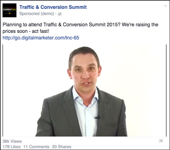
Facebook added video ads to their platform in 2015… and what a blessing they’ve been.
There’s so much more that can be said in a video ad than in an image, and if used correctly video ads can not only work to cold traffic but also for retargeting.
The beauty of Facebook videos ads is that you can now create website custom audiences of people who watch the video and retarget them with other ad campaigns (perfect for cold traffic).
You can also use video ads to retarget people who have visited your site or visited certain pages on your site.
That’s exactly what we did with the ad above.
We hold an annual event called Traffic & Conversion Summit. The above ad was used to retarget people who had visited the sales page to buy tickets but didn’t actually buy.
Ryan Deiss (our Co-Founder and CEO) shot a quick video that said something like this…
“Hey there (arms waving), before you go, if you’re watching me right now it’s because you’ve heard of Traffic & Conversion Summit — XX discount is about to end, if this video is here then the offer is still active, BUT — you have to get it now!”
There was incredible ad scent here because the sales page for the event features a video of Ryan.
So, we thought that seeing a retargeting ad with Ryan speaking to them again would definitely make them stop in their newsfeed.
We were right. 
This campaign had a 3,858% ROI!
The best part? It only took 20 minutes to shoot the video, upload it, and set up this retargeting ad.
This was VERY low hanging fruit… retargeting is simple to set up and you’re leaving a lot of money on the table if you aren’t following up with your prospects and customers.
4. Newsfeed Ad to Blog Content
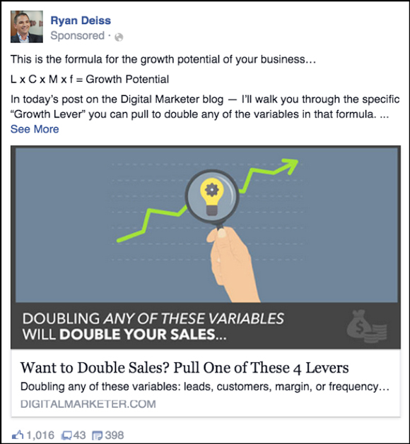
This ad was to cold traffic (people who were not connected to DigitalMarketer in any way).
We sent traffic to a blog post first to introduce ourselves to the audience, give value first, and to “pixel” people who clicked so we could retarget them with a relevant offer.
The copy for this ad is lengthy… which we recommend for any ads you’re using to send traffic to content.
It shows the end user that you’re going to provide value. Because they’ve never heard of you before, you need to really explain yourself and give them a reason to click.
You’re investing money INTO the relationship bank with your prospects by giving them value first BEFORE asking them to give you their contact information or buy something.
Revealing the formula in the ad copy creates curiosity to get people to click.
We use the verbage “Your business” to qualify the audience. We want people who own businesses to click.
The promise of the ad is incredible… we will teach you 4 ways to double your sales. This ad shows that a good promise/offer can even outweigh a mediocre message or image.
This ad generated 50,000 clicks to the blog post in order to prime the pump for this next ad…
5. Retargeting with a Newsfeed Ad to a Mini-Class
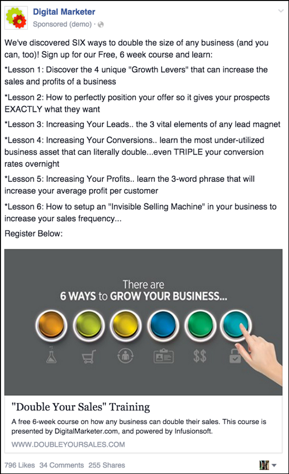
This ad campaign was used to generate leads for Double Your Sales, a free training course we released this year in partnership with Infusionsoft.
Double Your Sales isn’t your typical “Lead Magnet.” It’s a 6-week mini-class that takes dedication and time… it is not easily consumable.
That’s why this ad looks a bit different than our normal “Lead Magnet” ad.
Notice how long the copy is. We tested 3 variations of copy for this ad campaign (one was very short) and the long copy outperformed the others every time.
Why? Because this course is more of a commitment, we really have to sell someone with the ad copy.
We not only use the promise of teaching them 6 ways to double their business, we also give specifics as to what they’ll learn each week.
The image is super engaging and plays off of the message of there being 6 ways to double your business… and the finger pressing the button makes you want to ACT and actually click the ad.
This ad campaign has produced over 20,000 leads for DigitalMarketer in 2015.
6. Carousel Ad to Blog Content
Ah, carousel ads! Another new ad type that Facebook rolled out in 2015.
When scrolling through the newsfeed, you actually see the first image with an arrow pointing to the right that you can click on to scroll through the ad.
Carousel ads are awesome. Not only do they stand out in the newsfeed, they’re great for a couple reasons…
You can use each square to talk about a different benefit of a specific offer (all of them clicking over to the same page)
You could also use them to highlight different testimonials for your business or product and retarget people who visited your sales page but didn’t buy
In this case, we used the ad carousel ad type to promote 4 different blog posts (each square goes to a different URL).
This is the first panel…
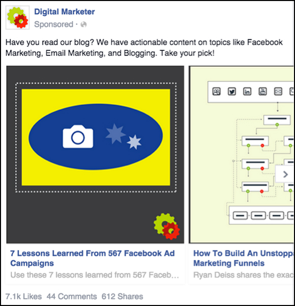
… and this is the second panel that someone sees if they click the arrow to move the carousel…
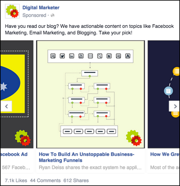
… and the third…
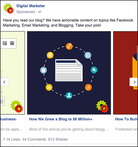
… the fourth…
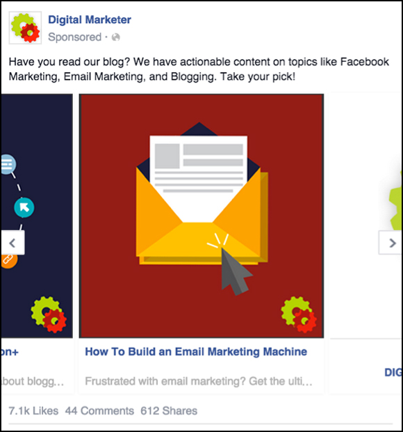
… and the fifth…
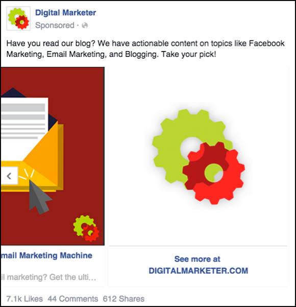
We ran this ad to cold traffic and allowed people to select which topic they were most interested in.
The best part of this is that because of retargeting, we were able to follow up with these people with offers that were most specific to the blog post they clicked over to.
If they clicked on the blog post about Facebook ads… we retargeted them with an ad for our Lead Magnet about Facebook ads. If they clicked on the blog post about email marketing, we retargeted them with an ad for our Lead Magnet about… you guessed it… email marketing. 
This ad sent 15,000+ clicks to various blog posts.
7. Newsfeed Ad to Perpetual Product Launch
This ad sends traffic to a perpetual launch for our email marketing product called The Machine.
Last year, our ad for this product targeted people who already knew the benefit of an email list or those who had an email list.
We wanted to broaden the marketing message to take this product to a different audience. So, we developed a new campaign.
The message of the 2015 campaign boils down to…
“the average adult receives 147 emails a day”
…and called out to business owners by asking them how they were going to stand out in the inbox.
Here’s the ad…
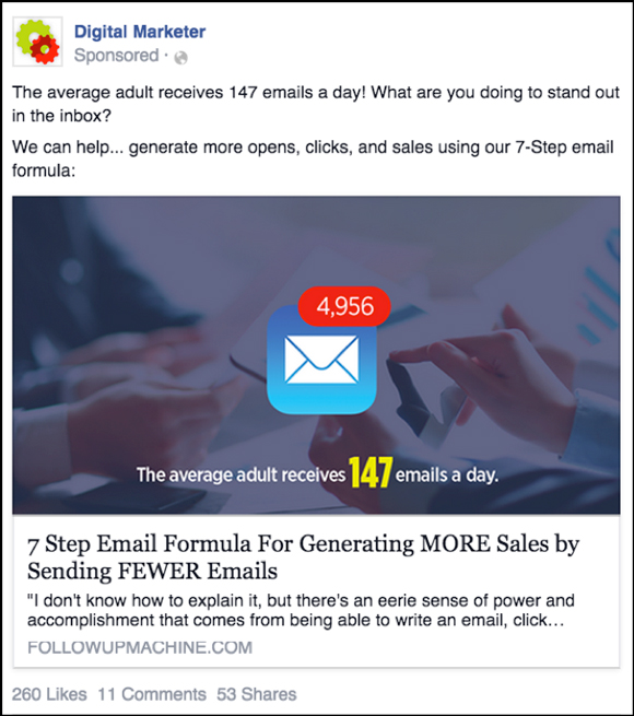
This new messaging was all about broadening the marketing message and it WORKED. We also use a quote (that reads like a story) in the newsfeed description that stops dead in the middle and creates curiosity.
“We can help” makes them feel like they are apart of something bigger.
The ad image appeals to most people because everyone knows what that blue email icon means and sees it daily… and having almost 5k emails in your box would stress most people out. The image is eye-catching and speaks to a pain point.
This campaign has put more than 20,000 people into a perpetual launch for our product, The Machine, and is consistently running at 80%+ ROI positive.
(NOTE: Want the Ultimate Facebook Ad Template Library? Copy and paste these 7 proven Facebook ad campaigns to create low-cost, high-converting ads on demand. Get them here.)
But don’t stop there!
Check Out the 7 Facebook Ad Lessons We Learned in 2014…
1. Newsfeed Ad to Lead Magnet #1
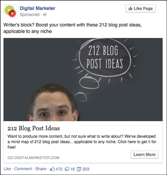
This ad is for our 212 Blog Post Ideas Lead Magnet.
This is 1 of our all-time best ads. It’s generated over 30,000 leads for under $2.06 a piece.
(Want to learn our optimization strategy for generating those 30,000 leads? Click here.)
Why does it work?
The Image: The image features a person (and although this is Ryan Deiss, we ran the ad to a TON of audiences who have no idea who he is).
The person is looking at you. That’s eye-catching. Any ad where a person is applicable, we suggest using them in your image. Either make sure the person is looking forward or looking towards a part of the image you want them to pay attention to.
Also, the chalk on the chalkboard is unique—we found the chalkboard on Dreamstime and photoshopped the “212 Blog Post Ideas” on there.
The Copy: “Writer’s block? Boost your content with these 212 blog post ideas, applicable to any niche.”
This ad is speaking to people who blog. With the copy, we wanted to speak to a pain point—writer’s block.
We then gave them a benefit for clicking with the “Boost your content with these 212 blog post ideas.”
Lastly, we overcame the objection that these ideas may not work for them by adding “applicable to any niche.”
2. Newsfeed Ad to Lead Magnet #2

This ad is for our Social Media Headline Swipe file. It’s the biggest ad campaign we’ve ever run on Facebook. It’s a similar ad and funnel (designed to put people into our DM Lab continuity program) to the 212 Blog Post Ideas that I covered above.
This ad has generated over 33,000 leads for an average of $1.70 a piece.
Why does it work?
The Image: This image is distinctive. From the mouse patterns in the background to the contrasting colors, it makes you want to look. It also makes you want to look without being overly obnoxious.
That’s what’s important about this image. Gone are the days of running ads with obnoxiously loud colors and arrows just for the sake of grabbing someone’s attention.
That screams, “I’m going to ask you for money if you click here!” Not that standing out isn’t still important, but—make sure your ad makes sense from a design standpoint. You can hire someone on Fiverr or oDesk or create an ad using Canva.
The Copy: “Want more clicks from your Social Media posts? Download our 72 headline swipe file.”
This ad is speaking to people who are social media managers or are interested in social media. With the copy, we wanted to speak to a pain point—no one is clicking on my posts!
We then gave them a solution… “Download our 72 headline swipe file.”
If I were to optimize this further, I would have added “applicable to any niche” as you saw in the 212 blog post ideas.
“Steal Our Swipe File” was important copy to have on the image. Telling someone to steal from you is certainly an interruption as they scroll down their newsfeed.
3. Newsfeed Ad to High-Ticket Product Lead Generation
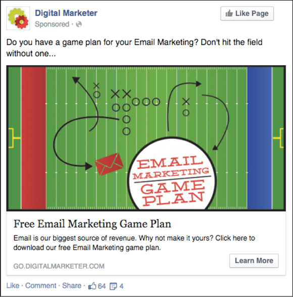
This ad generated leads for a launch of our product called The Machine. We were giving away our email marketing game plan in exchange for email addresses.
This ad generated 7,422 conversions at $1.54 per lead.
Why does it work?
The Image: After looking at demographics for the audience of website visitors that had already hit this product’s website, I noticed that over 90% of visitors were male.
It was also late summer/early fall and football season was starting. In order to tie in with the “game plan” aspect of the offer, we went with a football field.
Tying in a theme that would relate to your target audience is a great way to relate.
The image’s color (yet still not obnoxious, see my comments on the previous ad) and the football field/formation makes you STOP, it also ties perfectly with the offer being a “game plan.”
We wanted to make sure email marketing was still tied into the theme of the image, and that’s why the “Email Marketing Game Plan” copy is on the field along with the red envelope.
The Copy: “Do you have a game plan for your Email Marketing? Don’t hit the field without one…”
This ad ran to people who were interested in email marketers, mostly males. Again, as most of our successful ads do, the copy began with a question.
This copy appeals to someone’s urge to have a plan and to be prepared.
Also, even if you do have a plan for your email marketing, you can always improve upon it…
4. Newsfeed Ad to Lead Magnet #3
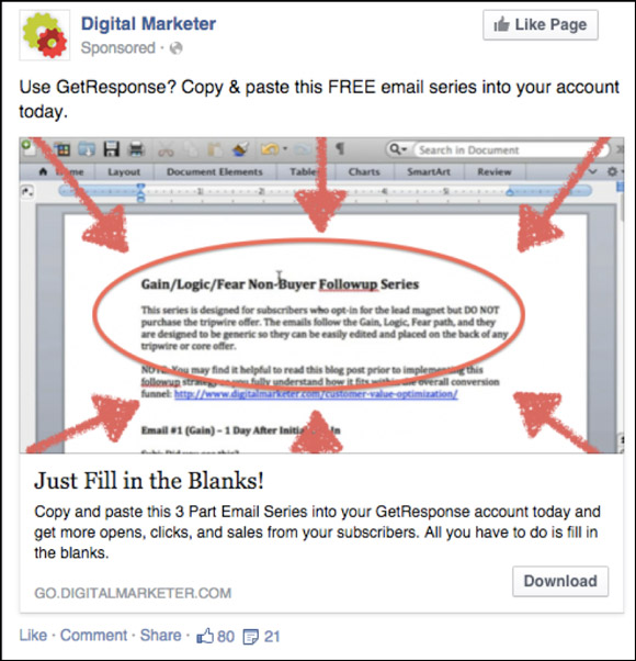
This ad is part of a bigger campaign for our Gain, Logic, Fear email template campaign. We’re giving away a 3-part email series that users can copy and paste into their email service provider in exchange for their email address.
This ad has generated 4,441 leads for $1.90 a piece.
Why does it work?
The Image: What makes this ad so successful is the strategy behind it, not necessarily the image.
This image goes against the statement I made in ad #2 that people are catching on to the obnoxious colors and arrows that scream “BUY SOMETHING FROM ME”! If I were to do this over, I’d still use the text/word document screenshot but have a designer make it look more professional.
(2015 Update: As you can see in our most recent ads, we have moved WAY beyond this type of image in our ads, but this strategy still works. Just be careful that you aren’t calling out to the audience about something that is against Facebook’s ad policy such as identifying the person by name or mentioning a disease they might have. )
It shows them EXACTLY what they’re going to get and how easy it really will be to just copy and paste these templates.
 But like I said, the strategy was the most important part of this campaign…
The Copy: This campaign had multiple ad sets that targeted different email service providers via interest targeting… MailChimp, Aweber, ConstantContact, Infusionsoft, Getresponse, etc.
Each ad set had different ad copy. This example shows the ad copy for GetResponse.
“Use GetResponse? Copy and paste this FREE email series into your account today.”
Replace “Use________?” with the email service provider I was targeting in each ad set and that was the copy for each of these ads…
The copy was VERY targeted and specific.
The “Copy & paste this FREE email series into your account today.” made people think:
The email series was specific to their service provider so why wouldn’t they use it
The email series is FREE, you’re not going to be asked to buy something on the landing page
This is something I can USE today… I don’t have to wait to implement or learn something and then do it. I can simply copy and paste…
Think of a way you could apply this tactic to your ads. How can I take this 1 Lead Magnet or offer and slightly alter the targeting and copy to become even more specific?
5. Retargeting Ad to a High-Dollar Product
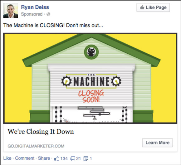
If you’re ever selling something that is timely, that won’t always be available, you HAVE to run an ad like the 1 above.
We ran this ad to everyone who had hit The Machine website or opted in during the pre-launch of that product.
Once we were about to close registration for the class, we ran this ad for 72 hours. Boy, do people jump for things that they think are going to be gone soon…
We spent $3,196.15 on this ad and saw $211,682 in return.
That’s the most profitable 3-day ad we’ve ever run. 
There isn’t much to discuss in terms of image or copy for this ad other than the ad maintained the same design/feel that we had used to introduce them to The Machine (the football field ad for example). Also, the ad was eye-catching (of course) and would have stopped them in their tracks while scrolling through Facebook.
The most important take away from this ad is the scarcity.
“The Machine is Closing! Don’t miss out…” and “We’re Closing it Down.”
6. Retargeting Ad to a Low-Dollar Product
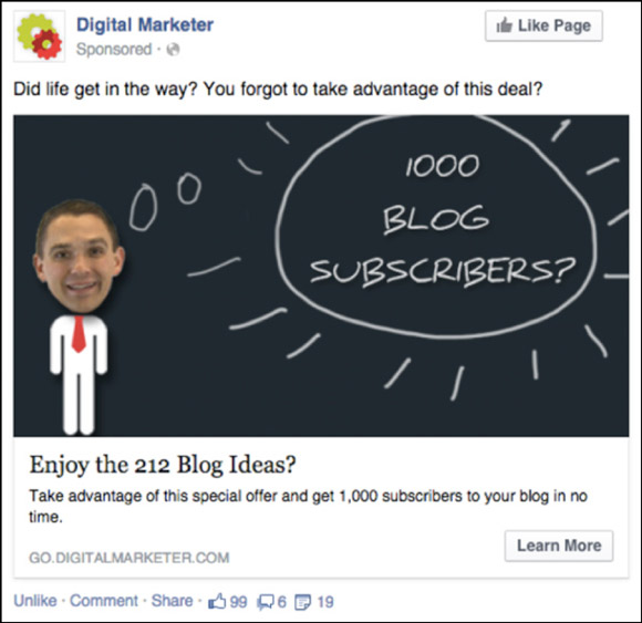
Look familiar? This is a retargeting ad for the funnel I introduced in ad #1 above.
This ad runs to people who opt in for the 212 Blog Post Ideas Lead Magnet but don’t take us up on our $7 Tripwire offer for our 1,000 Blog Subscribers execution plan.
Why does it work?
The Image: You’ll notice that the ads are VERY SIMILAR. You want to catch their attention by showing them something that they’re familiar with, but create a bit of variation so they don’t think it’s the same ad.
You’ll also notice that second ad says “1,000 Blog Subscribers”—this is because the Tripwire teaches you how to get your first 1,000 blog subscribers.
The Copy: The most important thing to keep in mind is the copy. We use “Did life get in the way? You forgot to take advantage of this deal?.”
This is the SAME COPY we use for EVERY retargeting ad. It saves you from writing a ton of copy and it is always applicable.
It also assumes that they didn’t say “NO” the first time and there is an important psychological principle at play here.
The words “Did life get in the way?” and “You forgot…” give the prospect a reason to reconsider the offer. Because if they said “NO” to the offer—you’re asking the prospect to admit they were wrong the first time—and that isn’t easy. With this ad, we assume they didn’t have their credit card last time, their children distracted them, they went to dinner and forgot, etc.
Here’s another example of a retargeting ad, this one retargets people who opted in for the Social Swipe File (ad #2 in this blog post) but didn’t purchase the Tripwire from that funnel:
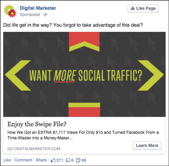
To learn more about how we dynamically retarget throughout our funnels using Facebook Website Custom Audiences, click here.
7. Facebook Offer Ad to High-Ticket Event
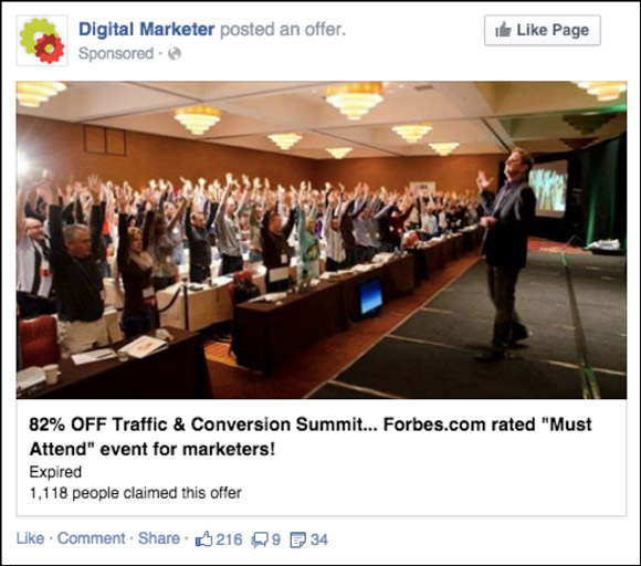
This is a Facebook offer. Facebook offers are a certain kind of ad for discounts, flash sales, etc. They appear differently in the news feed with a “Get Offer” Button in the bottom right-hand corner of the ad.
When they click the process is different, too. There’s a pop up that thanks them for claiming the offer, and then they’re given the link to claim the offer and it’s ALSO emailed to them!
The link that we use for the offer is always to a landing page.
For example, the ad above was 82% off tickets to T&C.
Why does it work?
Facebook offers are shared a ton and receive awesome organic reach because people want to share deals with their friends. Also, the email touch point is BIG.
The Image: This image shows a highly engaged conference. It catches people’s attention and shows them that Traffic & Conversion Summit isn’t a bore-fest.
The Copy: The copy displays the benefit… 82% off the event and also establishes credibility by says that Traffic & Conversion was recommended by Forbes, a credible source.
When used appropriately, offers are powerful Facebook advertisements.
Remember, advertising is all about placing the right message in front of the right audience.
(NOTE: Want the Ultimate Facebook Ad Template Library? Copy and paste these 7 proven Facebook ad campaigns to create low-cost, high-converting ads on demand. Get them here.)
The post Facebook Ad Lessons I Learned That Will Help You Run Better Ad Campaigns in 2019 appeared first on DigitalMarketer.
Read more: digitalmarketer.com
